install.packages(c(
  "colorBlindness", "directlabels", "dplyr", "ggforce", "gghighlight",
  "ggnewscale", "ggplot2", "ggraph", "ggtext", "ggthemes", "hexbin", "Hmisc",
  "mapproj", "maps", "munsell", "ozmaps", "paletteer", "patchwork", "rmapshaper",
  "scico", "seriation", "sf", "stars", "tidygraph", "tidyr", "wesanderson"
))ggplot2: Elegant Graphics for Data Analysis (3e) | Part 1
Getting Started
R
Data Visualization
Textbook Workthrough
Join me as I work through the exercises in the textbook.
1 Introduction
In this series of posts, I will be completing the exercises in ggplot2: Elegant Graphics for Data Analysis (3e), the ultimate guide to {ggplot2}. I wanted to practice this textbook to better my knowledge of {ggplot2}, but also get a feel for the design behind the package, The Grammar of Graphics.
“Without a grammar, there is no underlying theory, so most graphics packages are a big collection of special cases.”
I will not be re-iterating all of the information from the book, but provide a brief summary of each section and run through the exercises. Follow along to see my take on the exercises, as well as my notes and thoughts as I progress through the book.
If you would like to see the source code behind this post, you can click on the Code button at the top of right of the page, sandwiched between the title of the post and the side panel.
The book is split into five parts: Getting Started, Layers, Scales, The Grammar, & Advanced Topics. In this post, I will be working through the first part, Getting Started.
Tip
Because this is book about {ggplot2}, I will use package-explicit function when using a function for the first time that is not in base R or provided by {ggplot2}. All of these packages are loaded with the {tidyverse} meta-package.
Important
The book was still in development when writing this post, so some exercises might not match depending on when you are reading of this post.
1.1 Required Packages
2 First Steps
2.1 Introduction
The goal of this chapter it so introduce the reader to {ggplot2} as quickly as possible. Because it’s an intro, I will not be formatting the plots any further than the questions ask for.
2.2 Fuel Economy Data
In this chapter, we will be using mostly one data set, mpg, from http://fueleconomy.gov. It holds information about the fuel economy of popular car models in 1999 & 2009.
library(tidyverse) # Data Wrangling, includes {ggplot2}

mpg
# A tibble: 234 × 11
manufacturer model displ year cyl trans drv cty hwy fl class
<chr> <chr> <dbl> <int> <int> <chr> <chr> <int> <int> <chr> <chr>
1 audi a4 1.8 1999 4 auto… f 18 29 p comp…
2 audi a4 1.8 1999 4 manu… f 21 29 p comp…
3 audi a4 2 2008 4 manu… f 20 31 p comp…
4 audi a4 2 2008 4 auto… f 21 30 p comp…
5 audi a4 2.8 1999 6 auto… f 16 26 p comp…
6 audi a4 2.8 1999 6 manu… f 18 26 p comp…
7 audi a4 3.1 2008 6 auto… f 18 27 p comp…
8 audi a4 quattro 1.8 1999 4 manu… 4 18 26 p comp…
9 audi a4 quattro 1.8 1999 4 auto… 4 16 25 p comp…
10 audi a4 quattro 2 2008 4 manu… 4 20 28 p comp…
# ℹ 224 more rowsA quick overview of the variables:
ctyandhwyrecord miles per gallon (mpg) for city and highway driving.displis the engine displacement in liters.drvis the drivetrain: front wheel (f), rear wheel (r), or four wheel.modelis the model of car. There are 38 models, selected because they had a new edition every year between 1999 and 2008.classis a categorical variable describing the “type” of car: two seater, SUV, compact, etc.
2.2.1 Exercises
1. List five functions that you could use to get more information about the mpg dataset.
help(mpg)
glimpse(mpg)
head(mpg)
str(mpg)
View(mpg)
2. How can you find out what other datasets are included with {ggplot2}?
data(package = 'ggplot2')3. Apart from the US, most countries use fuel consumption (fuel consumed over fixed distance) rather than fuel economy (distance traveled with fixed amount of fuel). How could you convert cty and hwy into the European standard of l/100km?
us_to_euro = function(mpg) {
  # 1 mile = 1.60934 kilometers
  # 1 gallon (US) = 3.78541 liters

  g_p_m = 1 / mpg
  l_p_km = 3.78541 / 1.60934    # we multiply by 100 because it's "per 100"
  l100km = l_p_km * 100 * g_p_m # the denominator 100 cancels right hand 100

  return(l100km)
}

mpg |> dplyr::mutate(
  cty_euro = us_to_euro(cty),
  hwy_euro = us_to_euro(hwy),
  .keep = 'used')
# A tibble: 234 × 4
cty hwy cty_euro hwy_euro
<int> <int> <dbl> <dbl>
1 18 29 13.1 8.11
2 21 29 11.2 8.11
3 20 31 11.8 7.59
4 21 30 11.2 7.84
5 16 26 14.7 9.05
6 18 26 13.1 9.05
7 18 27 13.1 8.71
8 18 26 13.1 9.05
9 16 25 14.7 9.41
10 20 28 11.8 8.40
# ℹ 224 more rows4. Which manufacturer has the most models in this dataset? Which model has the most variations? Does your answer change if you remove the redundant specification of drivetrain (e.g. “pathfinder 4wd”, “a4 quattro”) from the model name?
mpg |> dplyr::count(manufacturer)
mpg |> count(model)
mpg |>
  mutate(model_base = stringr::str_extract(model, "^\\w+")) |>
  count(model_base) # yes
# A tibble: 15 × 2
manufacturer n
<chr> <int>
1 audi 18
2 chevrolet 19
3 dodge 37
4 ford 25
5 honda 9
6 hyundai 14
7 jeep 8
8 land rover 4
9 lincoln 3
10 mercury 4
11 nissan 13
12 pontiac 5
13 subaru 14
14 toyota 34
15 volkswagen 27# A tibble: 38 × 2
model n
<chr> <int>
1 4runner 4wd 6
2 a4 7
3 a4 quattro 8
4 a6 quattro 3
5 altima 6
6 c1500 suburban 2wd 5
7 camry 7
8 camry solara 7
9 caravan 2wd 11
10 civic 9
# ℹ 28 more rows# A tibble: 35 × 2
model_base n
<chr> <int>
1 4runner 6
2 a4 15
3 a6 3
4 altima 6
5 c1500 5
6 camry 14
7 caravan 11
8 civic 9
9 corolla 5
10 corvette 5
# ℹ 25 more rows2.3 Key Components
Every {ggplot2} plot has three key components:
- Data,
- A set of aesthetic mappings between variables in the data and visual properties, and
- At least one layer which describes how to render each observation. Layers are usually created with a geom function.
Here’s a simple example:
ggplot(mpg, aes(x = displ, y = hwy)) + geom_point()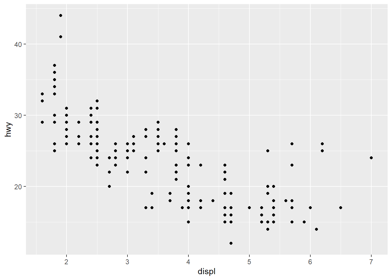
2.3.1 Exercises
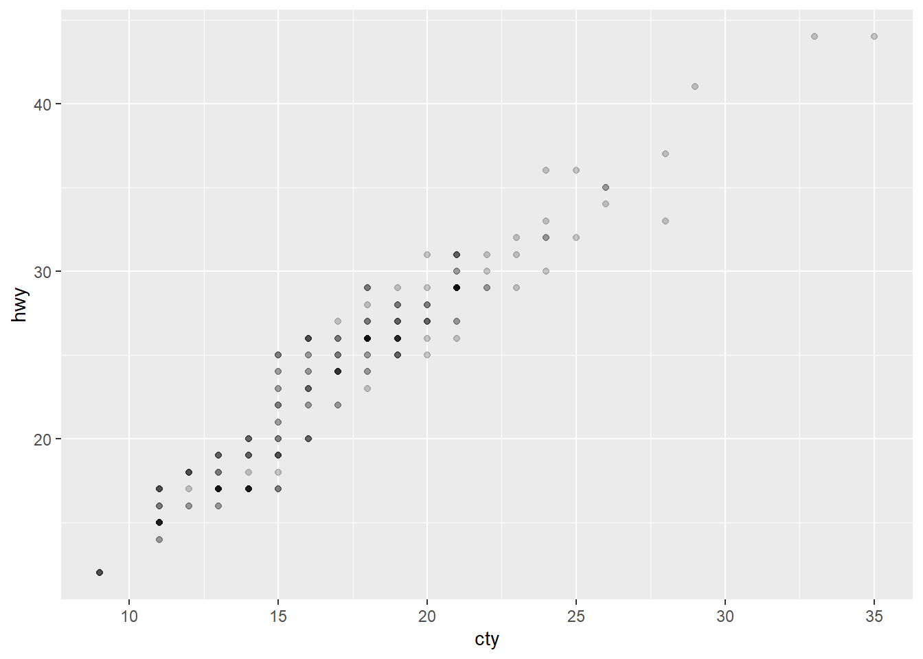
1. How would you describe the relationship between cty and hwy? Do you have any concerns about drawing conclusions from that plot?
There is a strong positive linear relationship between city & highway gas mileage. Just plotting only those two might generalize too much across different classes of vehicles. Even though it may be true, maybe different classes of vehicles are more equal in city vs highway gas mileage vs performing substantially better in one or the other.
2. What does ggplot(mpg, aes(model, manufacturer)) + geom_point() show? Is it useful? How could you modify that data to make it more informative?
ggplot(mpg, aes(model, manufacturer)) + geom_point()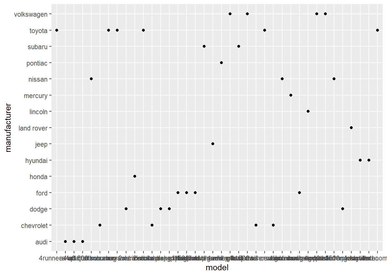
This plot just shows which manufacturers make which models. Having two categorical variables on a dot plot is not very useful as there is no inherent value in the relationship between two categories existing. Turning one category into a count() or other stat would show a dimensional relationship across the other category.
mpg |> count(manufacturer) |> ggplot(aes(n, manufacturer)) + geom_point()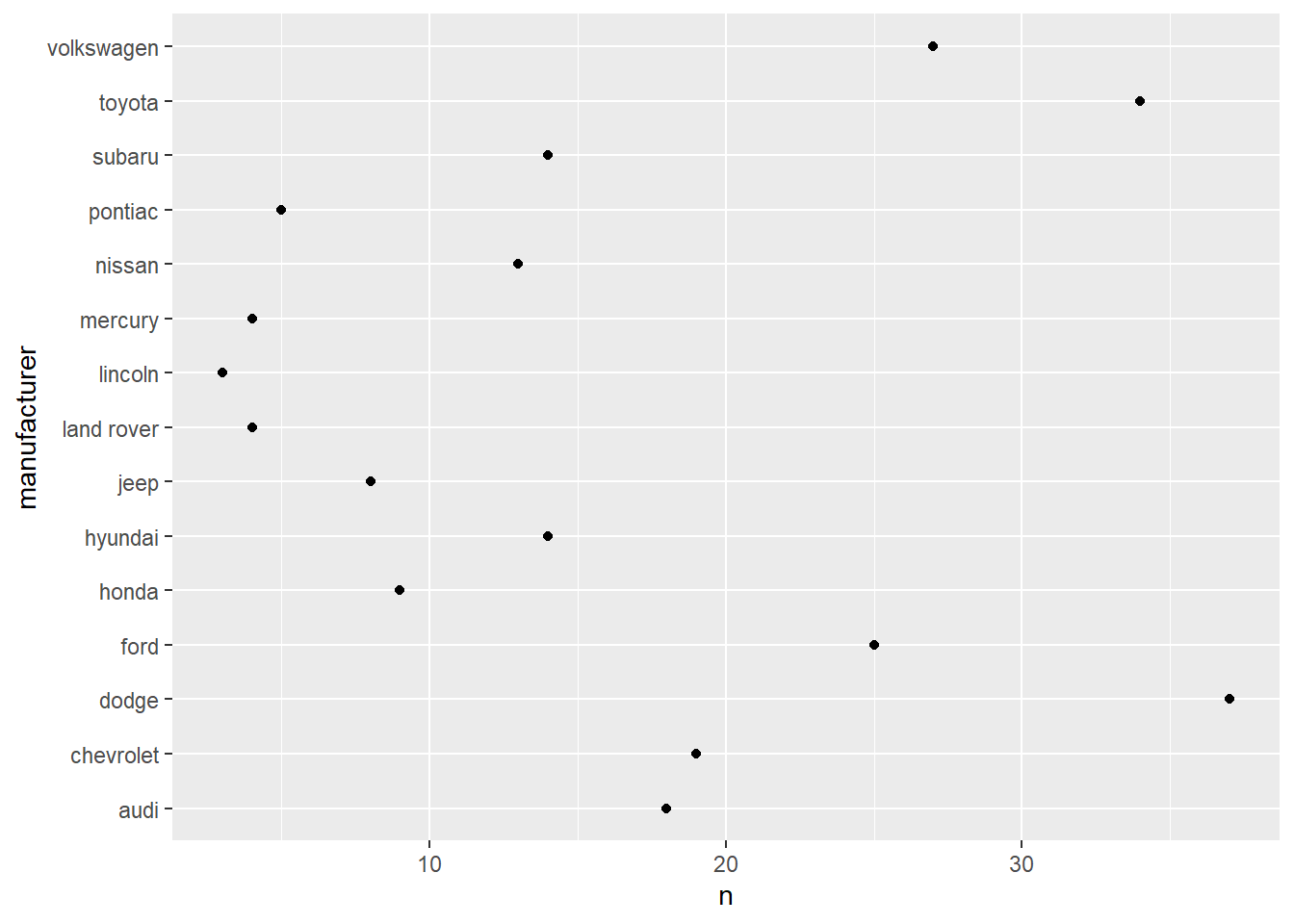
3. Describe the data, aesthetic mappings, and layers used for each of the following plots. You’ll need to guess a little because you haven’t seen all the datasets and functions yet, but use your common sense! See if you can predict what the plot will look like before running the code.
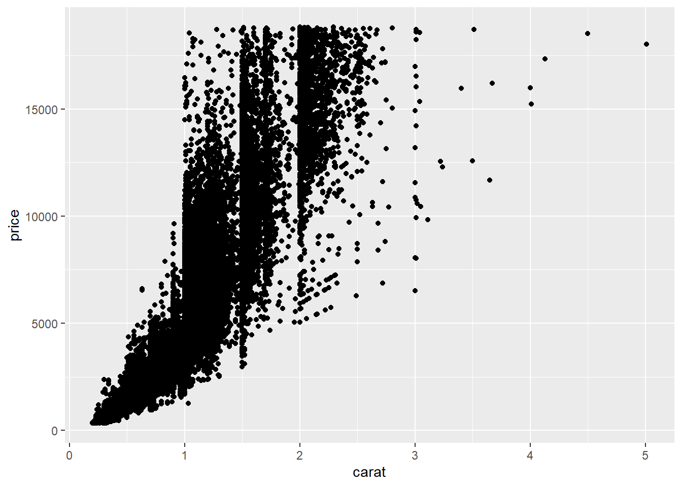
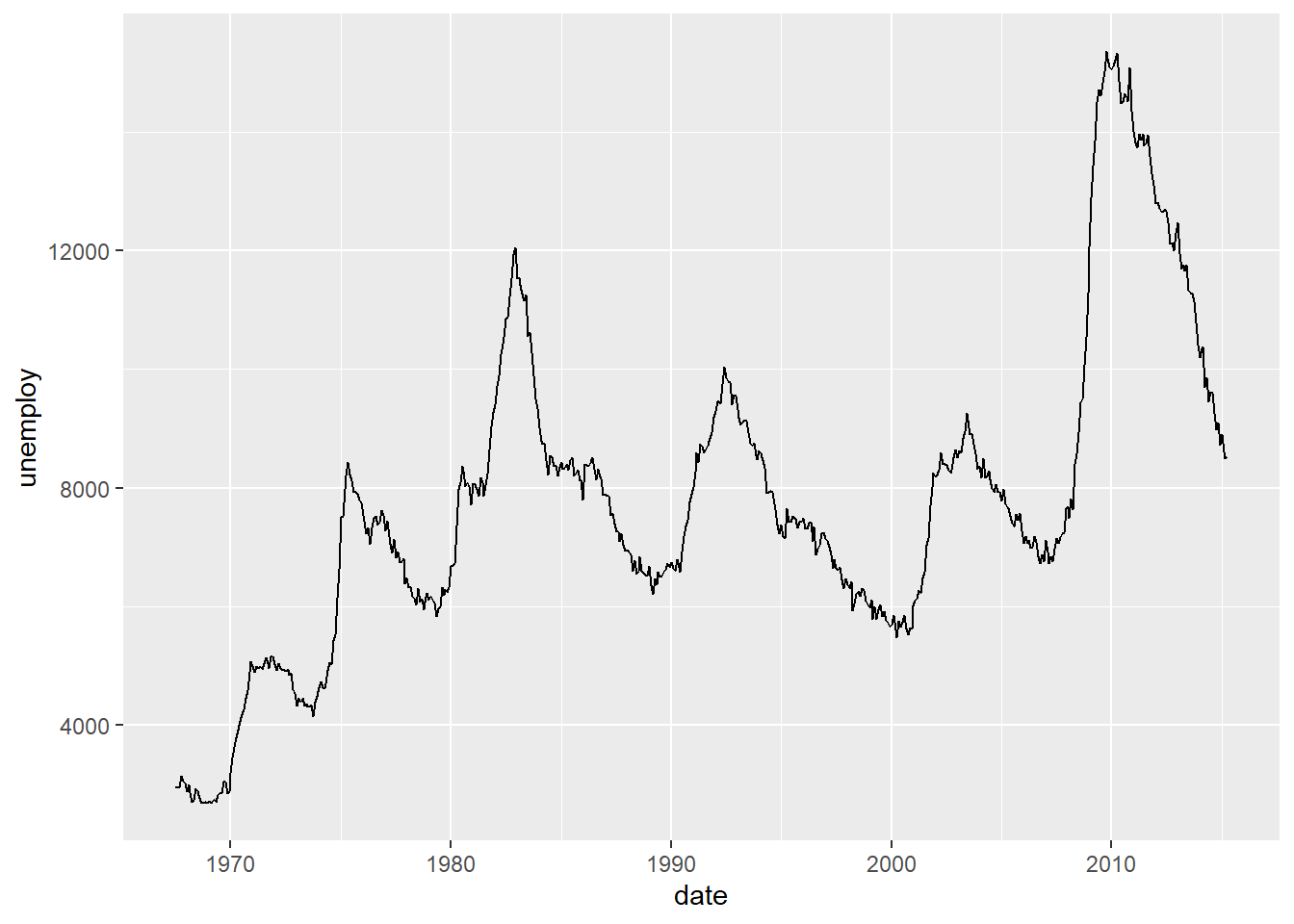
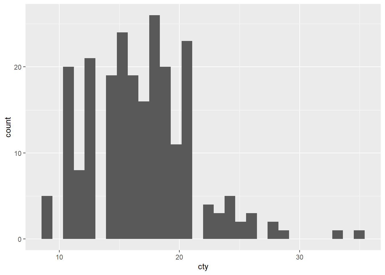
ggplot(mpg, aes(cty, hwy)) + geom_point()A dot plot showing a positive relationship between city mpg and highway mpg.ggplot(diamonds, aes(carat, price)) + geom_point()A dot plot showing a positive relationship between diamond price and its carat rating.ggplot(economics, aes(date, unemploy)) + geom_line()A line plot showing unemployment rate across time.ggplot(mpg, aes(cty)) + geom_histogram()A histogram showing the distribution of cars across city mpg rating.
ggplot(mpg, aes(cty, hwy)) + geom_point()
ggplot(diamonds, aes(carat, price)) + geom_point()
ggplot(economics, aes(date, unemploy)) + geom_line()
ggplot(mpg, aes(cty)) + geom_histogram()
2.4 Color, Size, Shape, and Other Aesthetic Attributes
To add additional variables to a plot, we can use other aesthetics like color, shape, and size. These work in the same way as the x and y aesthetics, and are added into the call to aes():
aes(displ, hwy, color = class)aes(displ, hwy, shape = drv)aes(displ, hwy, size = cyl)
ggplot(mpg, aes(displ, hwy, color = class)) + geom_point()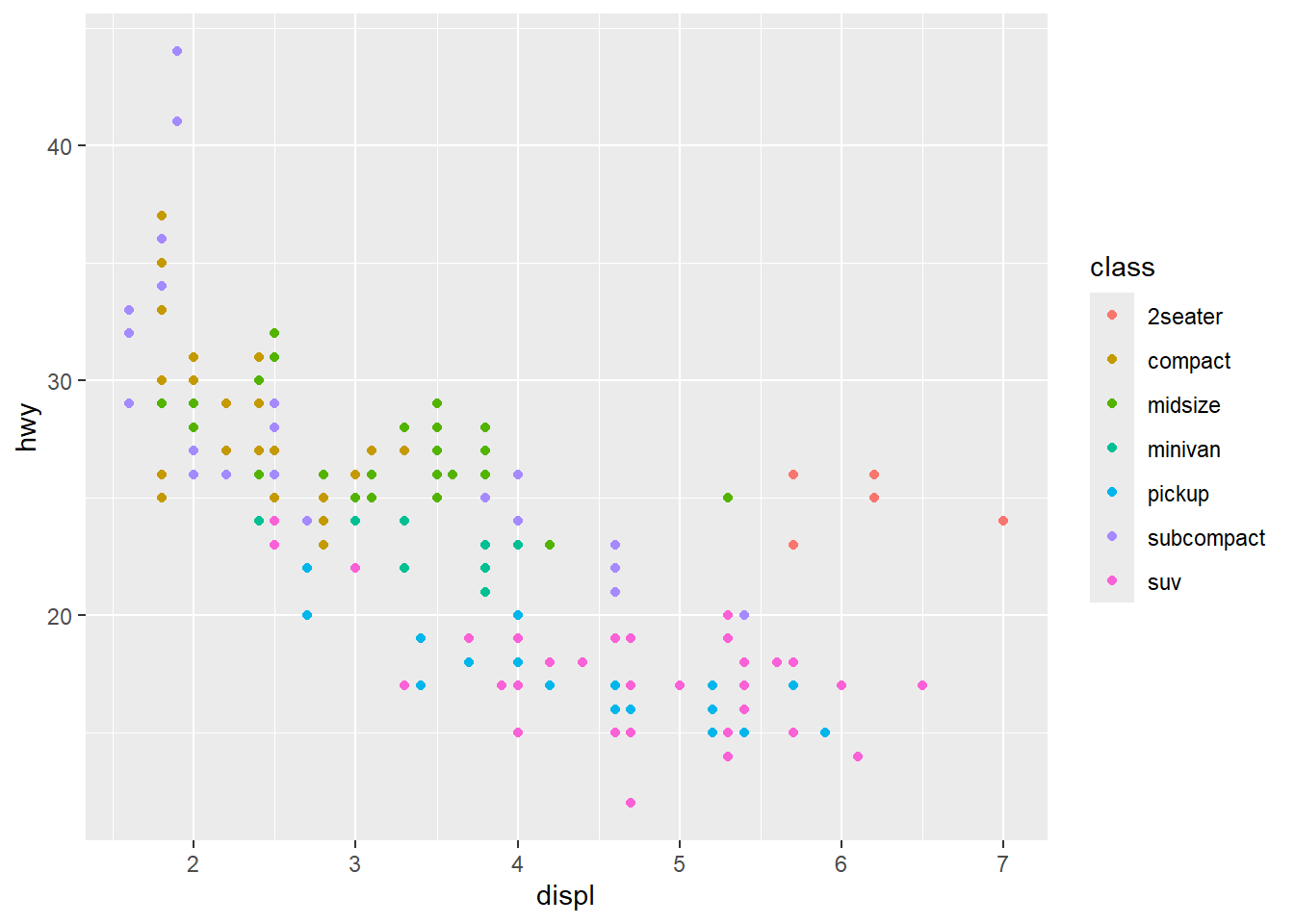
2.4.1 Exercises
1. Experiment with the color, shape and size aesthetics. What happens when you map them to continuous values? What about categorical values? What happens when you use more than one aesthetic in a plot?
ggplot(mpg, aes(displ, hwy, color = cyl)) + geom_point()
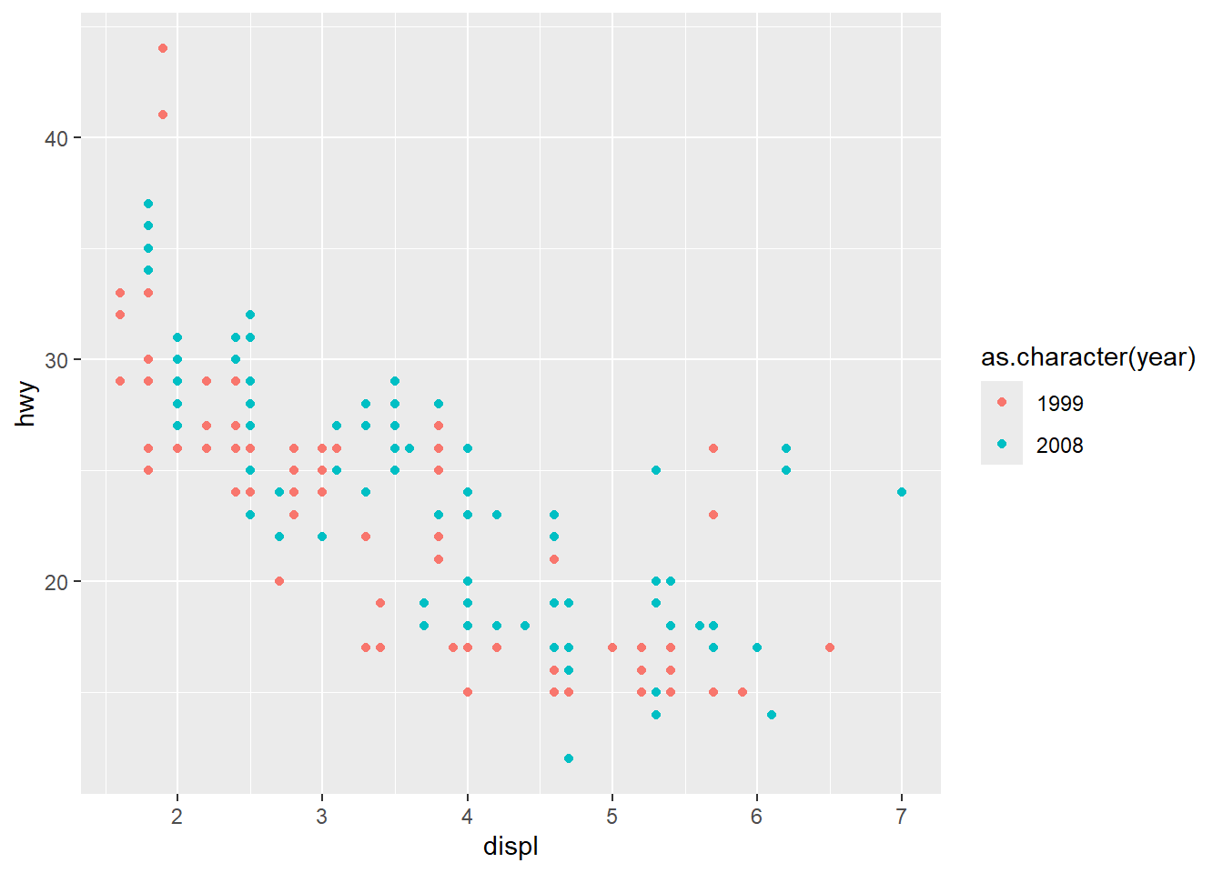
ggplot(mpg, aes(displ, hwy, color = as.character(year))) + geom_point()
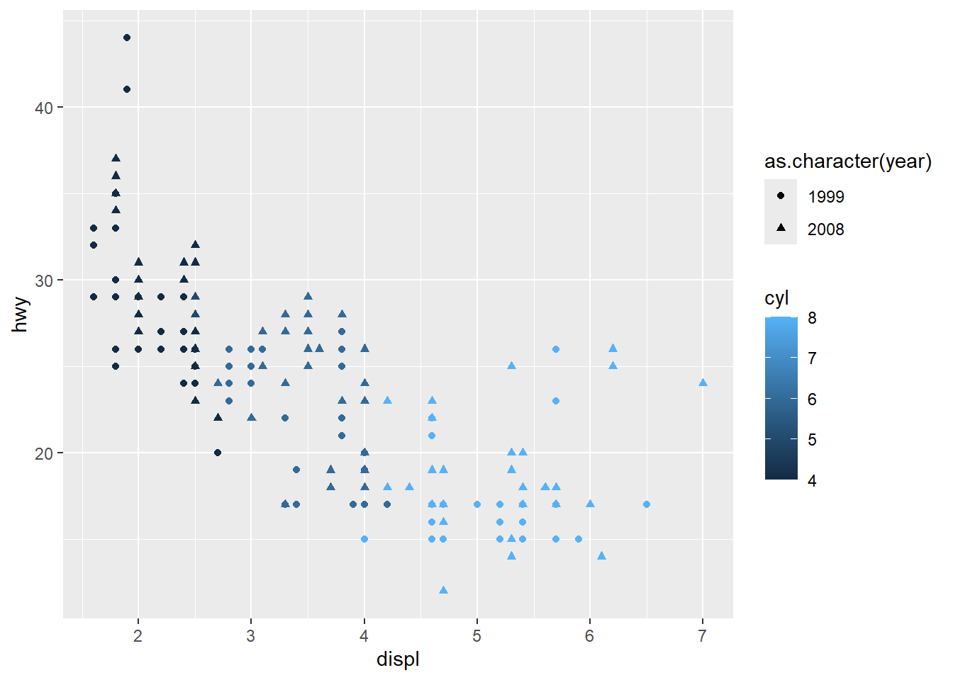
ggplot(mpg, aes(displ, hwy, color = cyl, shape = as.character(year))) + geom_point()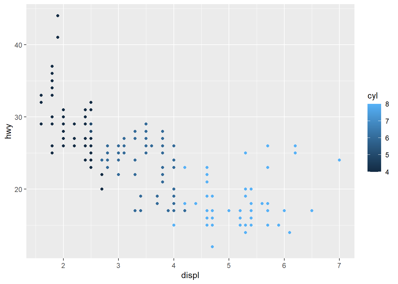
2. What happens if you map a continuous variable to shape? Why? What happens if you map trans to shape? Why?
ggplot(mpg, aes(displ, hwy, shape = hwy)) + geom_point()Error in `geom_point()`:
! Problem while computing aesthetics.
ℹ Error occurred in the 1st layer.
Caused by error in `scale_f()`:
! A continuous variable cannot be mapped to the shape aesthetic.
ℹ Choose a different aesthetic or use `scale_shape_binned()`.You get an error because continuous variables lie on a scale of infinity, and you cannot have infinite shapes. This is why in the previous question, converter year into a character because it is a continuous variable year = 1999 in the data frame, but its use is actually as a category, comparing 1999 vehicles to 2008 vehicles.
ggplot(mpg, aes(displ, hwy, shape = trans)) + geom_point()Warning: The shape palette can deal with a maximum of 6 discrete values because more
than 6 becomes difficult to discriminate
ℹ you have requested 10 values. Consider specifying shapes manually if you need
that many have them.Warning: Removed 96 rows containing missing values or values outside the scale range
(`geom_point()`).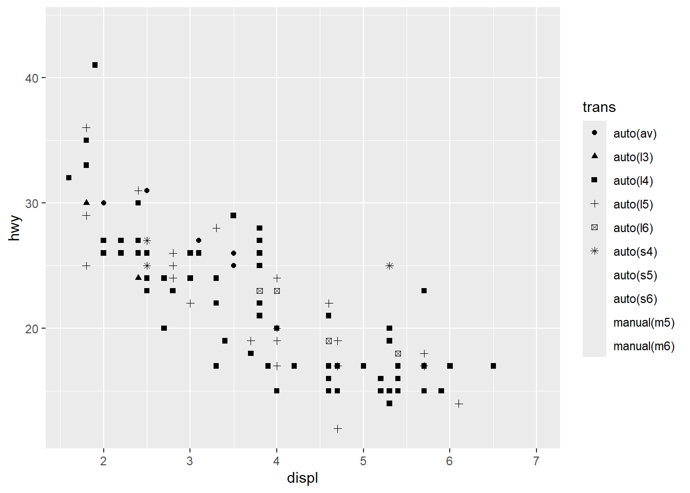
You get a warning because although trans is a categorical variable, it has more values than {ggplot2} has shapes (6 in total), so other values do not get markers.
This highlights the difference between Errors and Warnings with {ggplot2}. As with regular R code, Warnings show where the code can still run but probably with not the effect that was intended, where Errors are impossible to process and the code does not run.
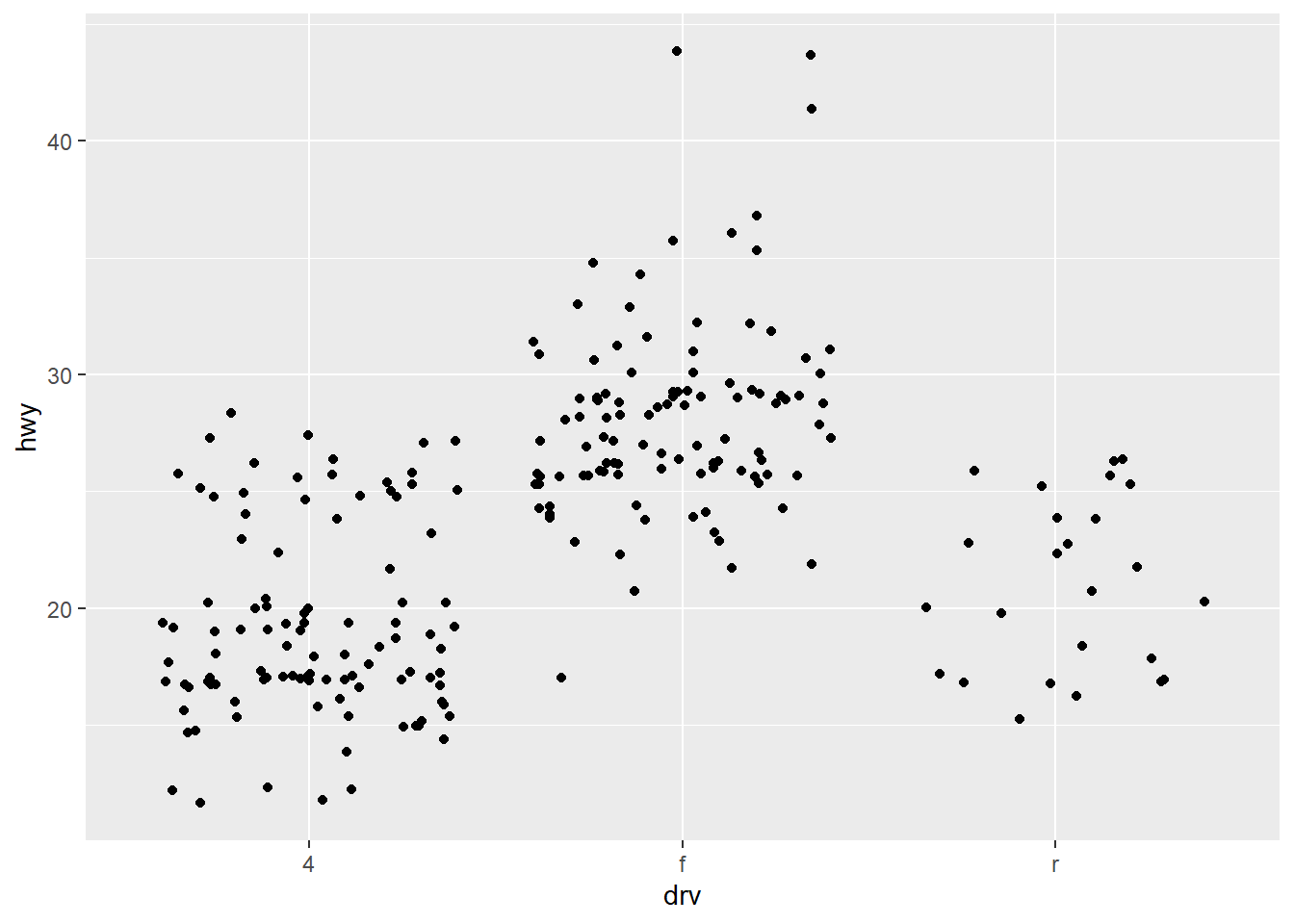
3. How is drive train related to fuel economy? How is drive train related to engine size and class?
ggplot(mpg, aes(drv, hwy)) + geom_point()
ggplot(mpg, aes(displ, class, color = drv)) + geom_point()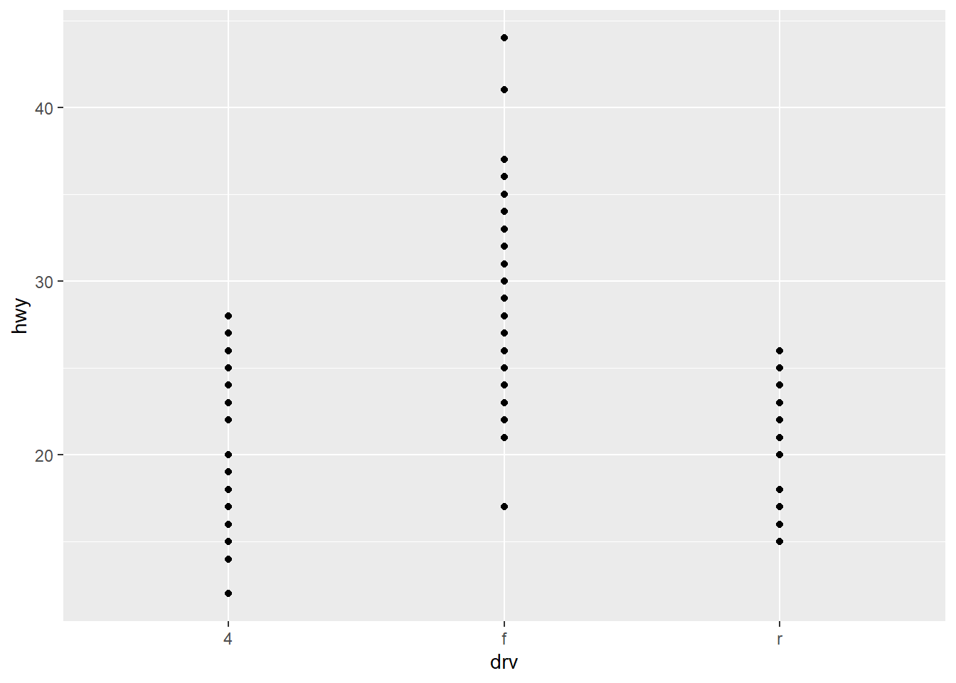
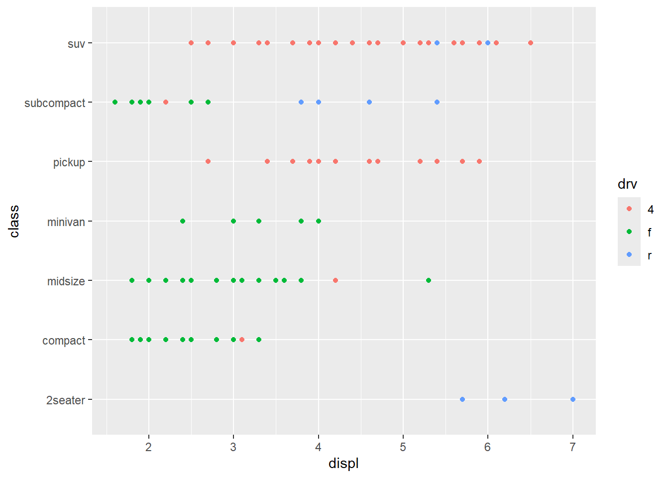
Front-wheel transmission vehicle seems to have the best highway gas mileage, where 4-wheel and rear-wheel show similar performance to each other.
Almost all 4-wheel drive vehicles (in this dataset) are either an SUV or Pickup, and have the biggest range in engine size. The smallest vehicles (2-seater & subcompact) have bigger engines and are rear-wheel drive, probably sports cars of some sort. Finally, the regular everyday vehicles like compact & midsize cars have smaller engines and mostly front-wheel drive transmissions.
2.5 Faceting
Faceting creates tables of graphics by splitting the data into subsets and displaying the same graph for each subset. The two type so faceting are grid and wrapped. We will be focusing on wrapped.
ggplot(mpg, aes(displ, hwy)) + geom_point() + facet_wrap(~class)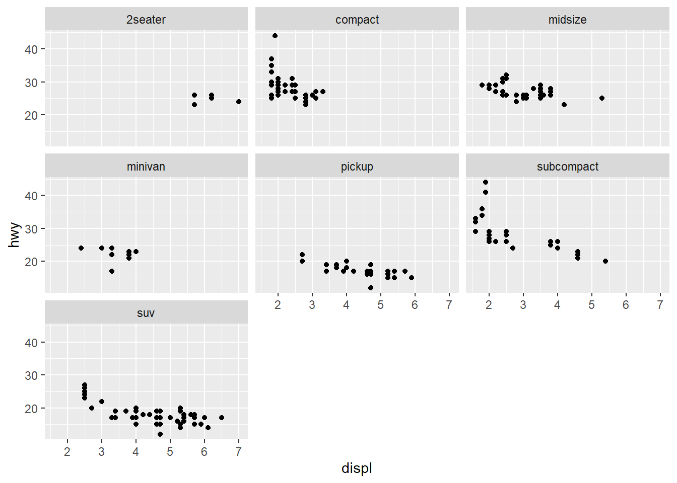
2.5.1 Exercises
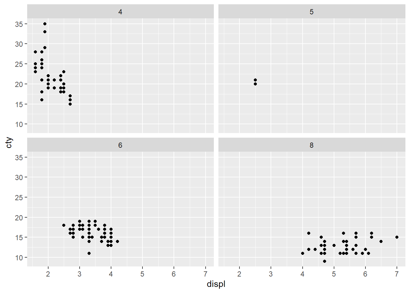
1. What happens if you try to facet by a continuous variable like hwy? What about cyl? What’s the key difference?
ggplot(mpg, aes(displ, cty)) + geom_point() + facet_wrap(~hwy)
ggplot(mpg, aes(displ, cty)) + geom_point() + facet_wrap(~cyl)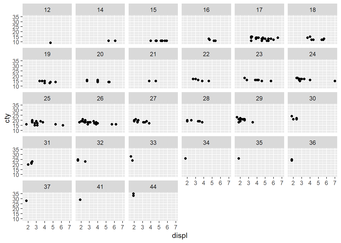
They both facet by the number of unique values in the variable. In the case of hwy, there were 27 unique values in this limited dataset because it truly represents a continuous variable. This makes it a bad choice for faceting.
cyl on the other hand, actually represents a category (# of cylinders in an engine) although it’s in the data frame as a continuous. This may be because it is a number, which is usually continuous.
2. Use faceting to explore the 3-way relationship between fuel economy, engine size, and number of cylinders. How does faceting by number of cylinders change your assessment of the relationship between engine size and fuel economy?
ggplot(mpg, aes(displ, hwy)) + geom_point() + facet_wrap(~cyl)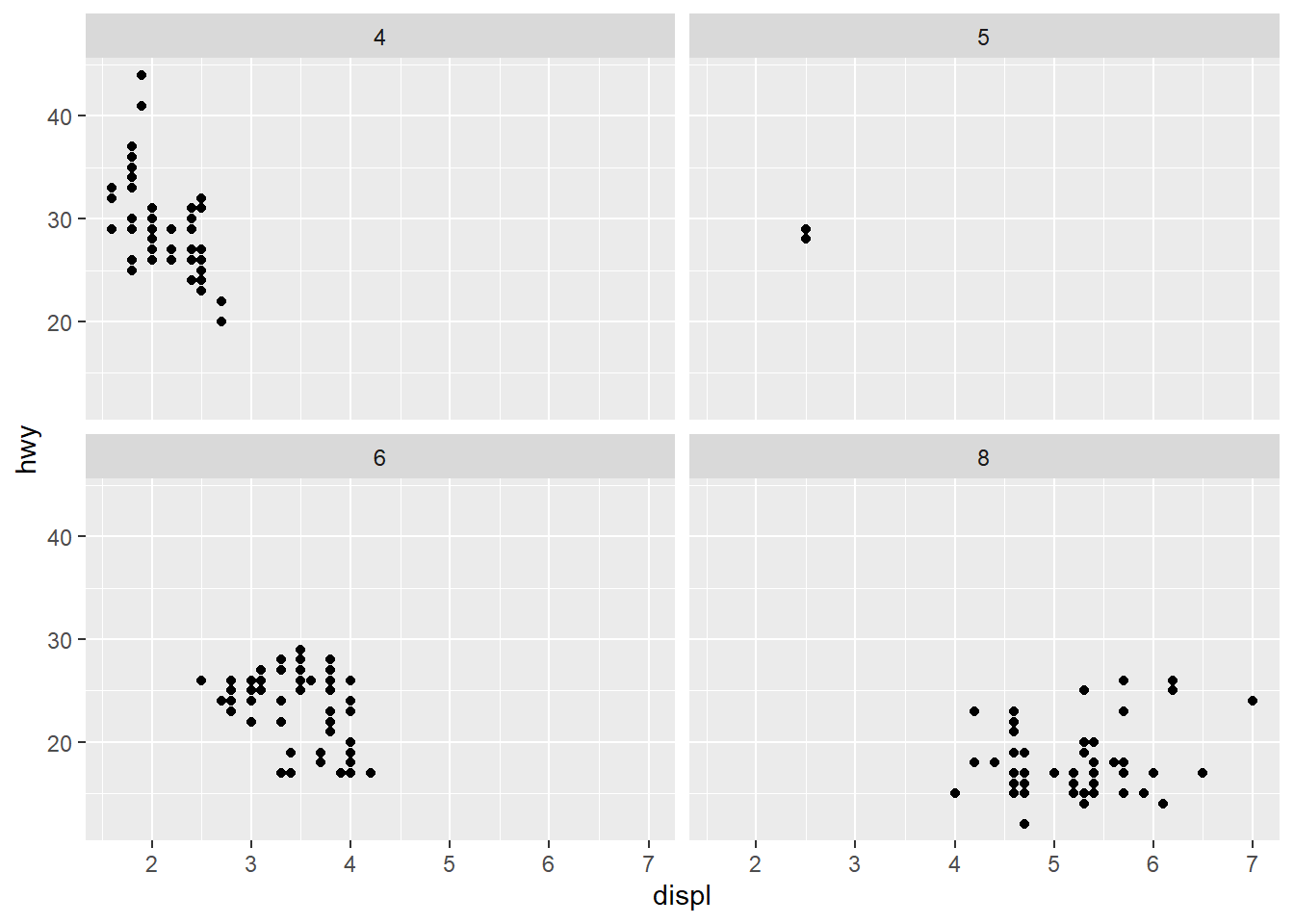
Faceting by cylinders shows a clearly that smaller engines perform better on fuel economy vs their bigger counterparts, though being a smaller engine does not necessarily mean that it will have good gas mileage.
3. Read the documentation for facet_wrap(). What arguments can you use to control how many rows and columns appear in the output?
nrow & ncol are the arguments to control the number of rows & columns. Here is an extreme example:
ggplot(mpg, aes(displ, hwy)) + geom_point() + facet_wrap(~trans, nrow = 1)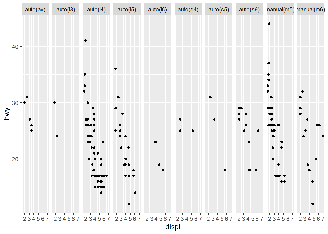
4. What does the scales argument to facet_wrap() do? When might you use it?
By default, the scales locks both the x and y scales on all faceted plots to show the same range, regardless of the range of values in each facet. You might want to free a scale if the axis doesn’t have any values for that facet, and the missing range doesn’t affect the analysis.
In this example, we don’t need x-axis values for vehicles that don’t exist, but keeping the y-axis values on the same scale helps to compare the values across all manufacturers.
mpg |>
  ggplot(aes(as_factor(cyl), hwy)) +
  geom_point() +
  facet_wrap(~manufacturer, scales = "free_x", nrow = 3)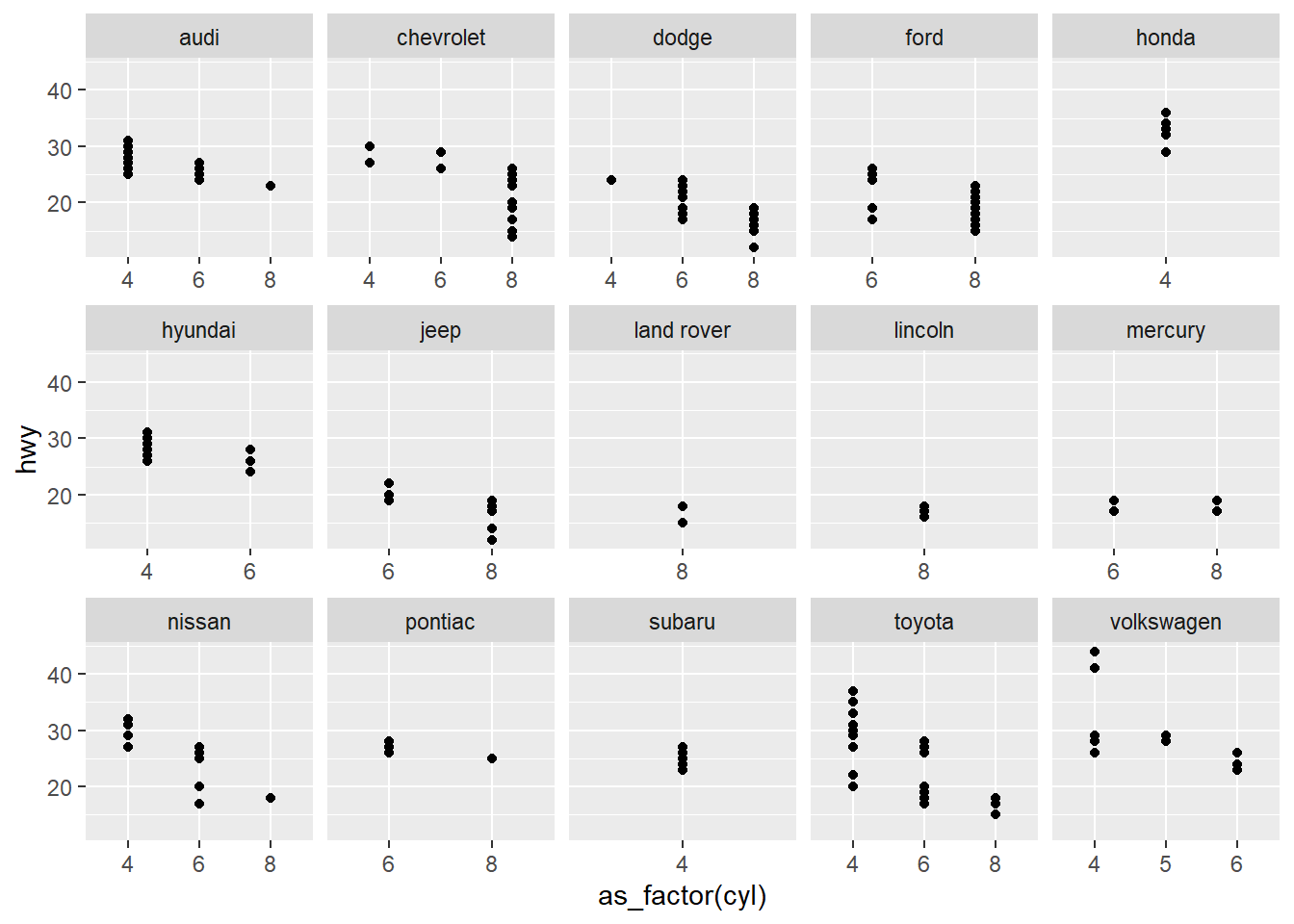
2.6 Plot Geoms
Substituting geom_point() for a different geom function creates a different plot. Who would’ve thought? In the following sections, we will cover some of the other most used geoms provided in {ggplot2}:
geom_smooth()fits a smoother to the data and displays the smooth and its standard error.geom_boxplot()produces a box-and-whisker plot to summarize the distribution of set of points.geom_histogram()andgeom_freqpoly()show the distribution of continuous variables.geom_bar()shows the distribution of categorical variables.geom_path()andgeom_line()draw lines between the data points. A line plot is constrained to produce lines that travel from left to right, while paths can go in any direction. Lines are typically used to explore how things change over time.
2.6.1 Adding a smoother to a plot
If you have a scatterplot with a lot of noise, it can be hard to see the dominant pattern. In this case, it’s useful to add a smoothed line to the plot with geom_smooth():
ggplot(mpg, aes(displ, hwy)) + geom_point() + geom_smooth()`geom_smooth()` using method = 'loess' and formula = 'y ~ x'-1.png)
An important argument to geom_smooth() is the method, which allows you to choose which type of model is used to fit the smooth curve:
method = "loess", the default for small n, uses a smooth local regression."span"controls the level of smoothing.method = "gam"fits a generalized additive model provided by the {mgcv} package. You need to load in the package then use aformula = y ~ s(x)ory ~ s(x, bs = "cs")(for large data).method = "lm"fits a linear model, giving the line of best fit.
ggplot(mpg, aes(displ, hwy)) + geom_point() + geom_smooth(span = 0.2)
ggplot(mpg, aes(displ, hwy)) + geom_point() + geom_smooth(span = 1)
library(mgcv)
ggplot(mpg, aes(displ, hwy)) +
  geom_point() +
  geom_smooth(method = "gam", formula = y ~ s(x))
ggplot(mpg, aes(displ, hwy)) + geom_point() + geom_smooth(method = "lm") with span-1.png)
 with span-2.png)
 with span-3.png)
 with span-4.png)
2.6.2 Boxplots and jittered points
When a dataset contains a categorical variable and one or more continuous variables, we might be interested in the distribution of the continuous variable(s) relative to the categorical variable. Because there a few unique number of values for both drv and hwy, there is a lot of overplotting. There are a few useful techniques to help with this issue:
ggplot(mpg, aes(drv, hwy)) + geom_point()
ggplot(mpg, aes(drv, hwy)) + geom_jitter()
ggplot(mpg, aes(drv, hwy)) + geom_boxplot()
ggplot(mpg, aes(drv, hwy)) + geom_violin()
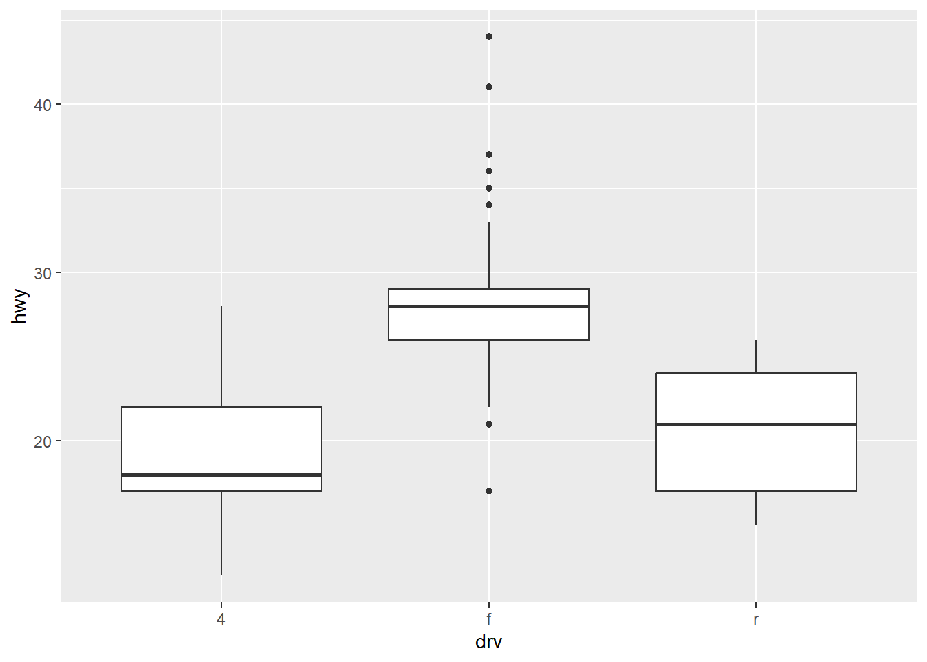
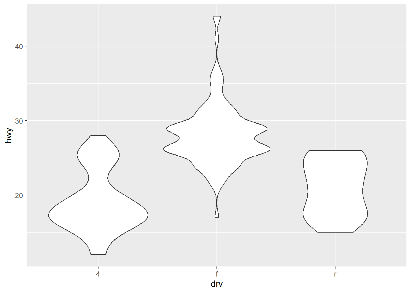
Though these are useful techniques, they also have their own drawbacks.
| Jitter Plots | Boxplots | Violin Plots |
|---|---|---|
| Add a little random noise to the data which can help avoid overplotting. | Summarize the shape of the distribution with a handful of summary statistics. | Show a compact representation of the “density” of the distribution, highlighting the areas where more points are found. |
| Show every point but only work with relatively small datasets. | Summarize the whole distribution with 5 statistics. | Give the richest display, but the density estimate can be hard to interpret. |
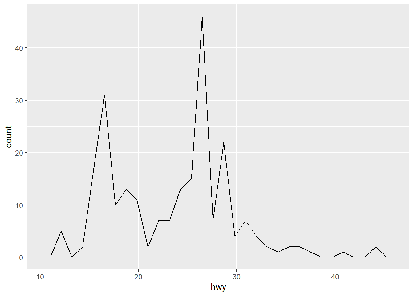
2.6.3 Histograms and frequency polygons
Histograms and frequency polygons show the distribution of a single numeric variable with more detail than a boxplot but at the expense of needing more space. The only difference between the two is that the prior uses columns and the latter uses lines.
ggplot(mpg, aes(hwy)) + geom_histogram()
ggplot(mpg, aes(hwy)) + geom_freqpoly()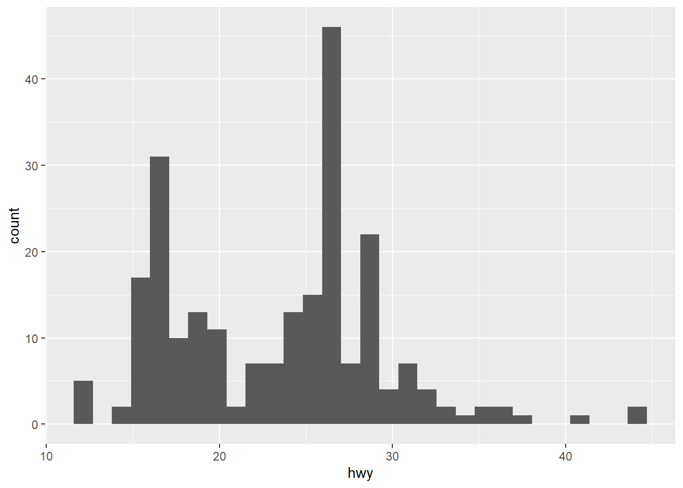
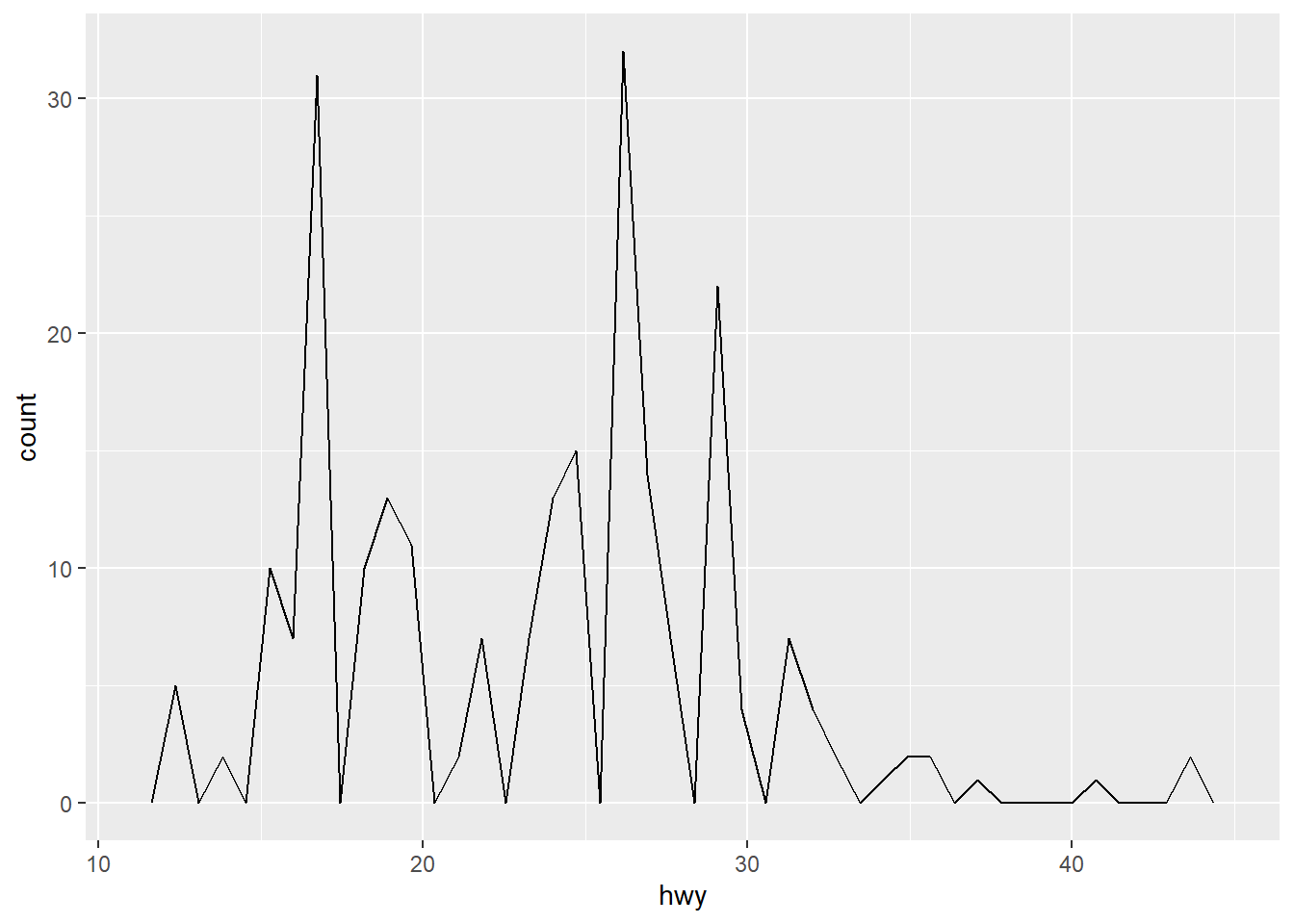
It is highly recommended to experiment with the bins as the default value is 30 and it is unlikely that 30 is the best choice for your dataset.
ggplot(mpg, aes(hwy)) + geom_freqpoly(bins = 15)
ggplot(mpg, aes(hwy)) + geom_freqpoly(bins = 45)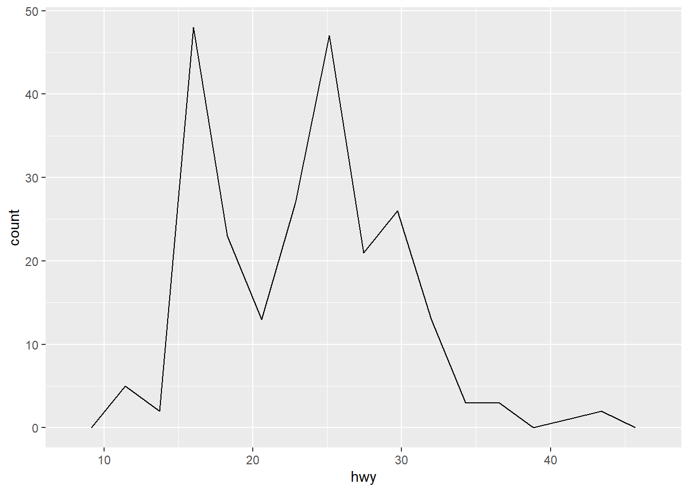
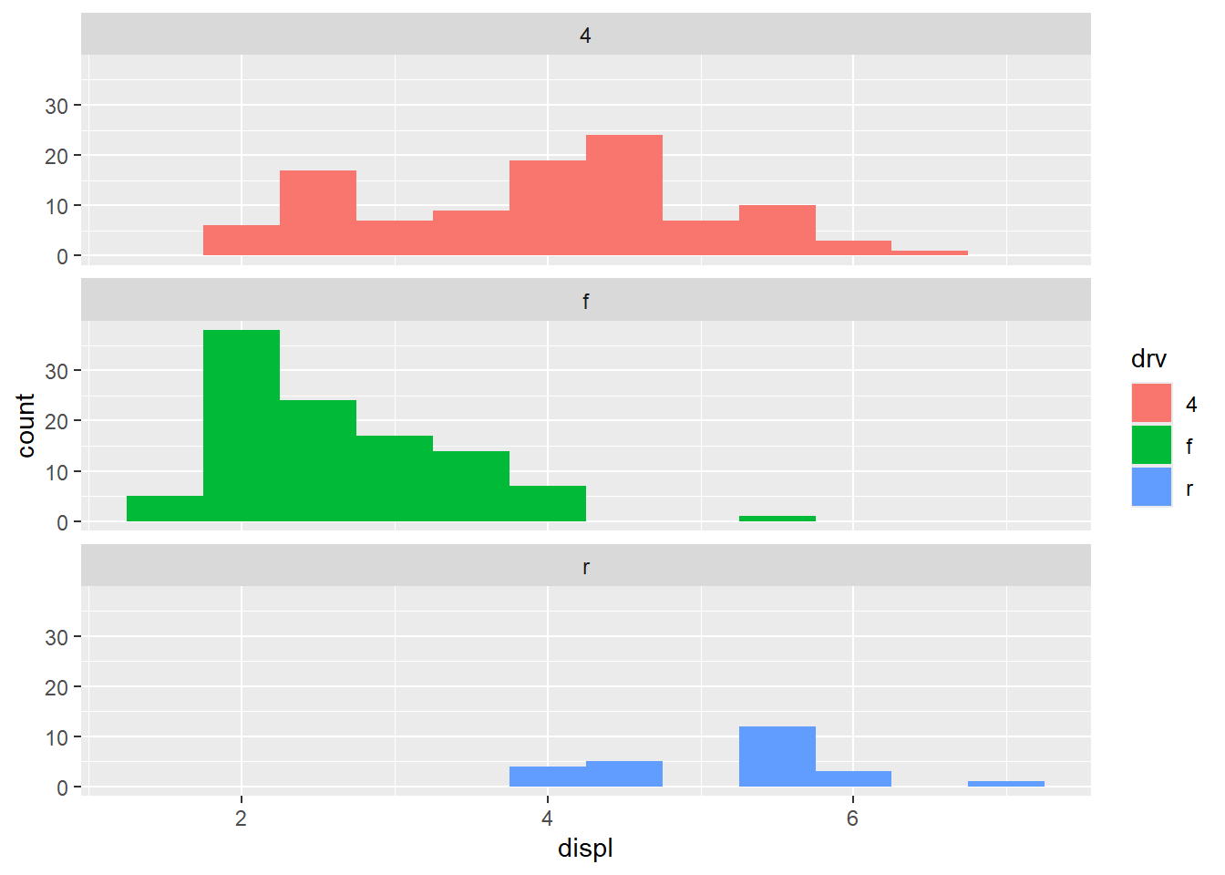
To compare distributions of subgroups, you can map a categorical variable to either fill (for geom_histogram()) or color (for geom_freqpoly()).
ggplot(mpg, aes(displ, colour = drv)) +
  geom_freqpoly(binwidth = 0.5)
ggplot(mpg, aes(displ, fill = drv)) +
  geom_histogram(binwidth = 0.5) +
  facet_wrap(~drv, ncol = 1)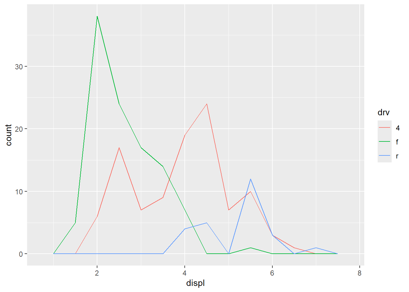
2.6.4 Bar charts
The discrete analogue of the histogram is the bar chart, geom_bar().
ggplot(mpg, aes(manufacturer)) + geom_bar()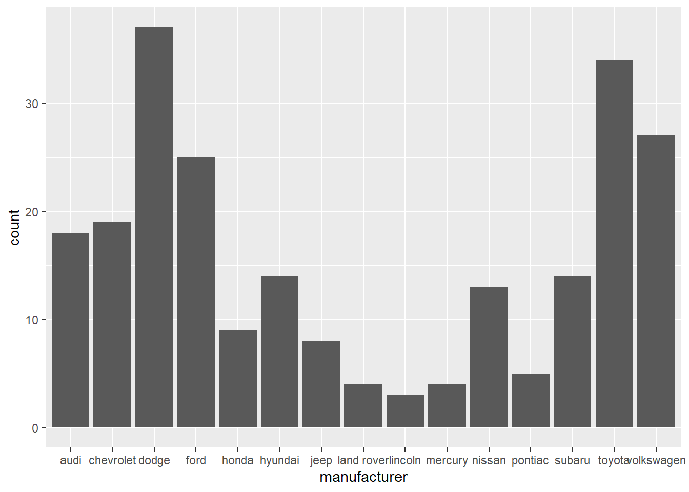
Bar charts can be confusing because there are two very different plots that are both commonly called bar charts.
- The first form, like above, assumes your data is not summarized, and each observation contributes to one unit to the height of each bar.
- The second form is used for pre-summarized data.
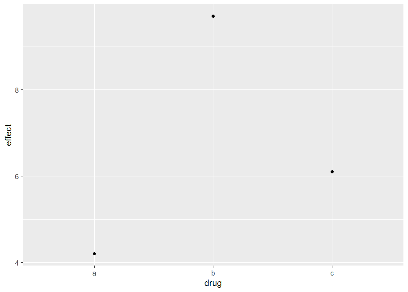
For example, you might have three drugs with the their average effect. To display this type of data, you have to tell geom_bar() to not run the default stat which bins and counts data. In this case, it’s better to use geom_point() because it takes up less space than bars, and don’t require that the axis includes 0.
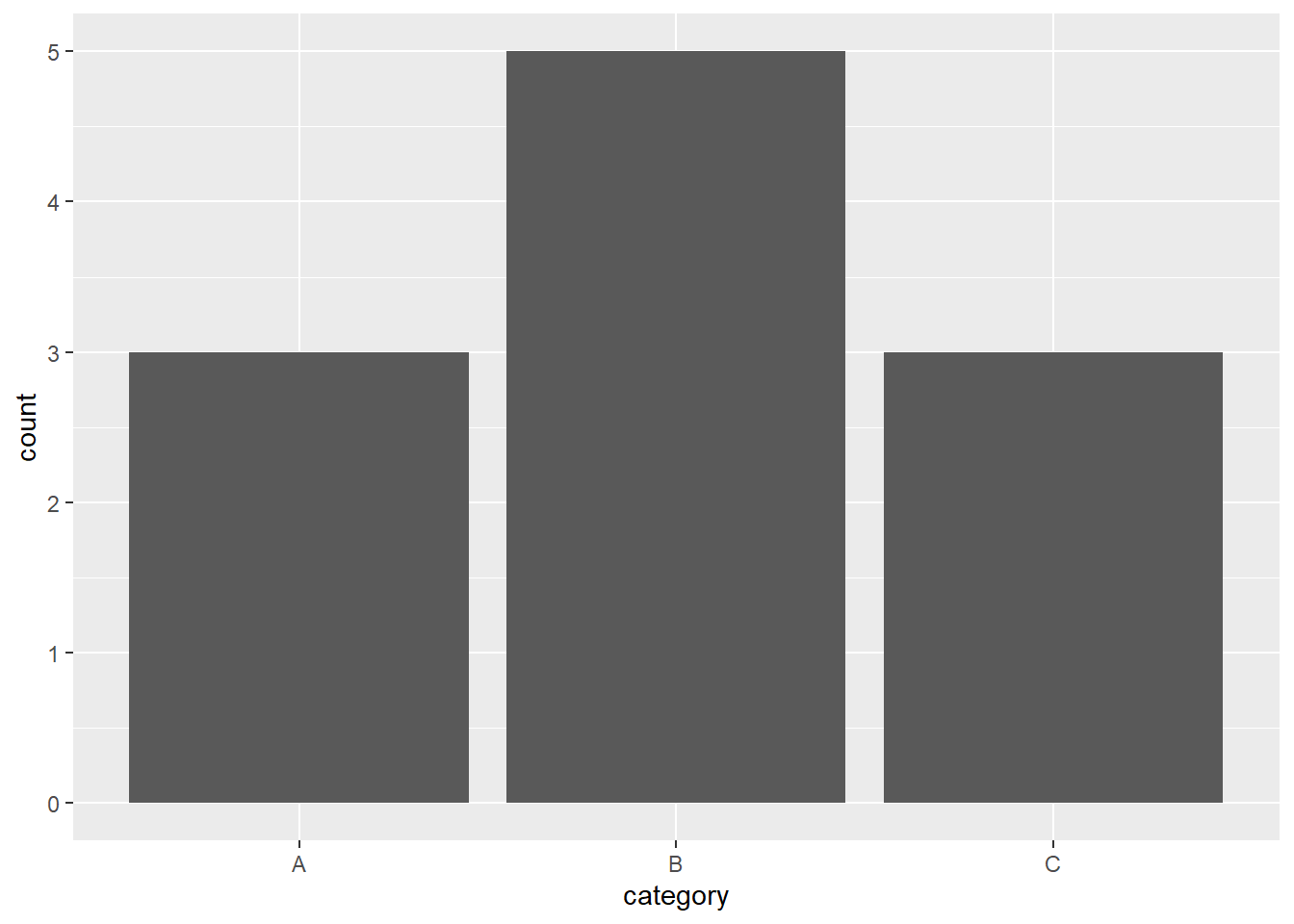
drugs = tibble(drug = c("a", "b", "c"), effect = c(4.2, 9.7, 6.1))

ggplot(drugs, aes(drug, effect)) + geom_bar(stat = "identity")
ggplot(drugs, aes(drug, effect)) + geom_point()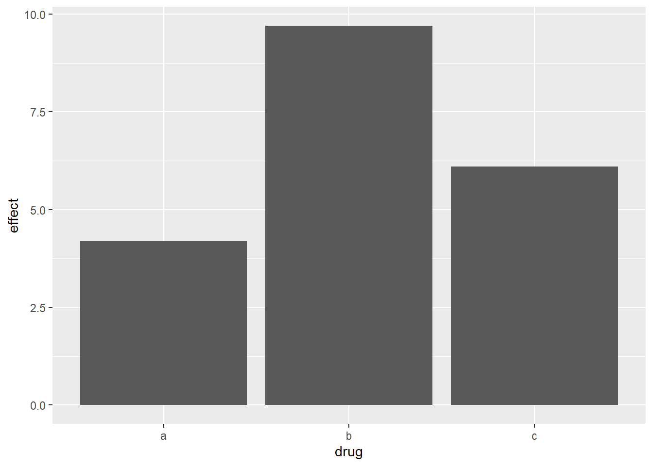
2.6.4.1 Bonus
Even if using geom_point() might be preferred, because the second type of bar/column chart is so popular, {ggplot2} includes a geom_col() that acts exactly the same as geom_bar(stat = "identity"):
ggplot(drugs, aes(drug, effect)) + geom_bar(stat = "identity")
ggplot(drugs, aes(drug, effect)) + geom_col()-1.png)
-2.png)
2.6.5 Time series with line and path plots
Line and path plots are typically used for time series data, where the order of the data matters to the context of the visual. Line plots join the data points from left to right, while path plots join the points in the order that they appear in the dataset.
| Line Plot | Path Plot |
|---|---|
| Plots the data from left to right. | Plots the points in the order they appear in dataset. |
| Show time on x-axis. | Show how two variables simultaneously change over time, with time encoded in the way the data points are connected. |
The two plots below show unemployment over time, both with geom_line(). The firsts shows unemployment rate while the second shows the median number of weeks unemployed.
ggplot(economics, aes(date, unemploy / pop)) + geom_line()
ggplot(economics, aes(date, uempmed)) + geom_line()-1.png)
-2.png)
To compare the relationship, we would like to draw both time series on the same plot. We could draw a scatterplot of unemployment rate vs length of time unemployed, but then we lose the dimension of time. The solution is to join points adjacent in time with line segments, forming a path plot.
ggplot(economics, aes(unemploy / pop, uempmed)) +
  geom_path() +
  geom_point()
ggplot(economics, aes(unemploy / pop, uempmed)) +
  geom_path(color = "grey50") +
geom_point(aes(color = lubridate::year(date)))-1.png)
-2.png)
2.6.6 Exercises
Note
Going through the exercises of this section, they don’t all completely line up with content above, so I believe this part is still a WIP. Regardless, I tried to answered the questions to the best of what I think the exercises are going for.
1. What’s the problem with the plot created by ggplot(mpg, aes(cty, hwy)) + geom_point()? Which of the geoms described above is most effective at remedying the problem?
Because the two values are so highly correlated, there might be some overplotting in the plot. We can check for overplotting imonn a scatterplot by adjust the alpha value of the points.
ggplot(mpg, aes(cty, hwy)) + geom_point()
ggplot(mpg, aes(cty, hwy)) + geom_point(alpha = 0.2)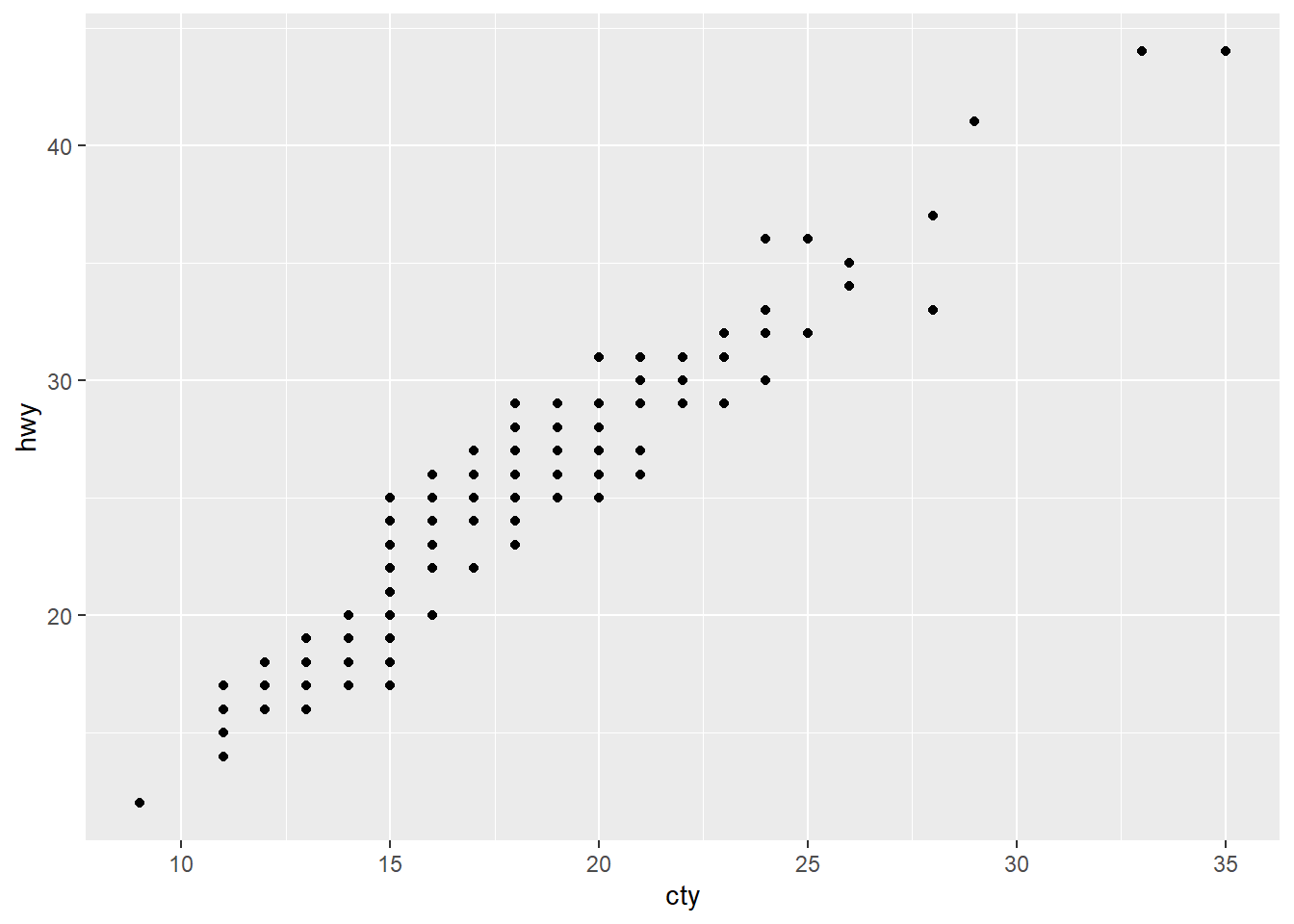

2. One challenge with ggplot(mpg, aes(class, hwy)) + geom_boxplot() is that the ordering of class is alphabetical, which is not terribly useful. How could you change the factor levels to be more informative? Rather than reordering the factor by hand, you can do it automatically based on the data: ggplot(mpg, aes(reorder(class, hwy), hwy)) + geom_boxplot(). What does reorder() do? Read the documentation.
ggplot(mpg, aes(class, hwy)) + geom_boxplot()
ggplot(mpg, aes(
  x = factor(class, levels = c(
    "pickup", "suv", "minivan", "2seater", "subcompact", "compact", "midsize")),
  y = hwy)) +
  geom_boxplot()
ggplot(mpg, aes(reorder(class, hwy), hwy)) + geom_boxplot()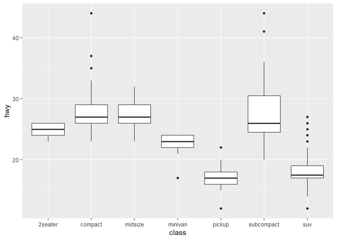
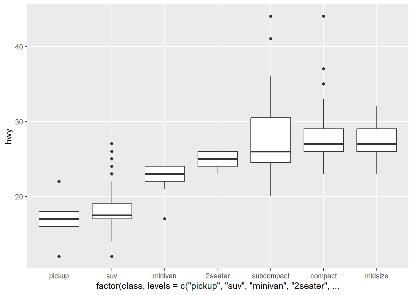
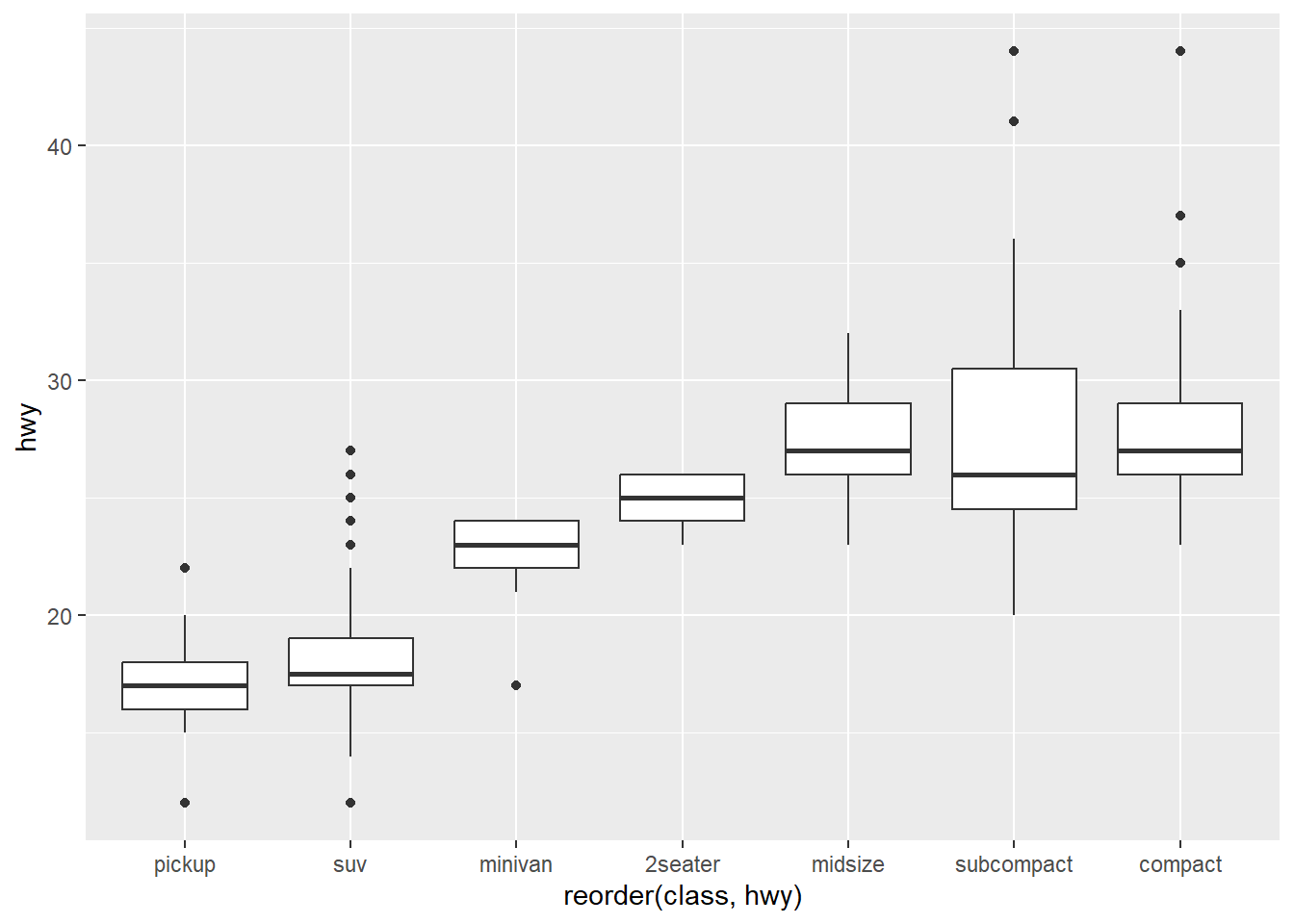
reorder() treats its first argument as a categorical variable, and reorders its levels based on the values of a second variable, usually numeric. Comparing my manual reordering (based on the median line of the boxplots), reorder() takes a different approach that doesn’t look apparently clear from the boxplot.
3. Explore the distribution of the carat variable in the diamonds dataset. What binwidth reveals the most interesting patterns?
You can use either bin or binwidth to distribute the columns of a histogram. You can test bin values arbitrarily until you find a plot that looks good, but using the binwidth argument, you can make educated guess as to where to begin and go because the value is directly related to the value/scaling of the x-axis.
ggplot(diamonds, aes(carat)) + geom_histogram(binwidth = 1/10)
ggplot(diamonds, aes(carat)) + geom_histogram(binwidth = 1/50)
ggplot(diamonds, aes(carat)) + geom_histogram(binwidth = 1/100)
ggplot(diamonds, aes(carat)) + geom_histogram(binwidth = 1/500)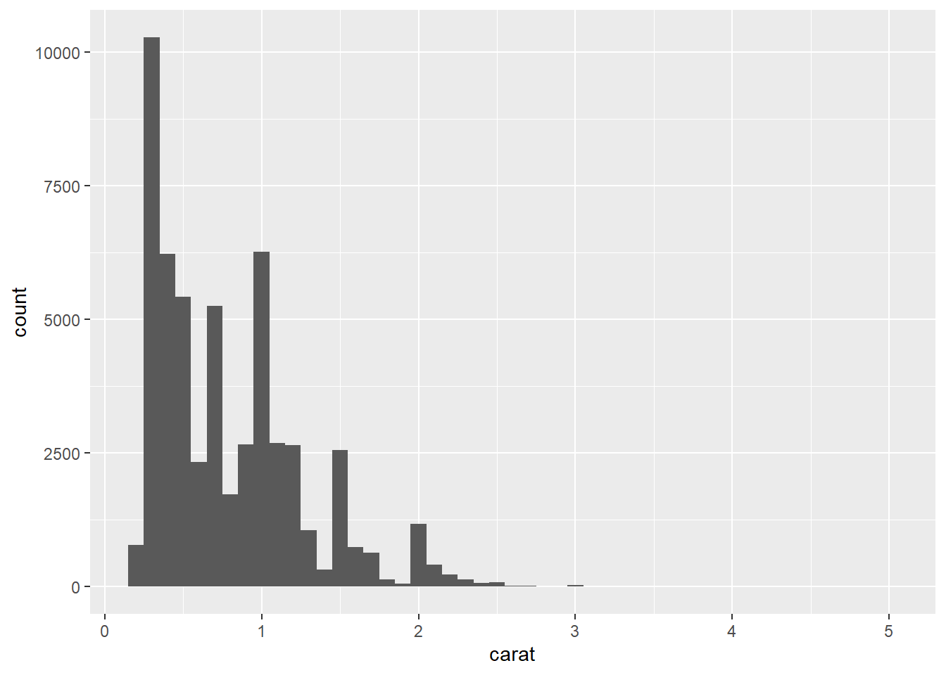
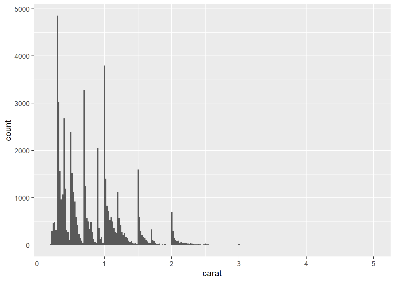
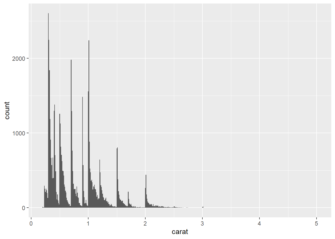
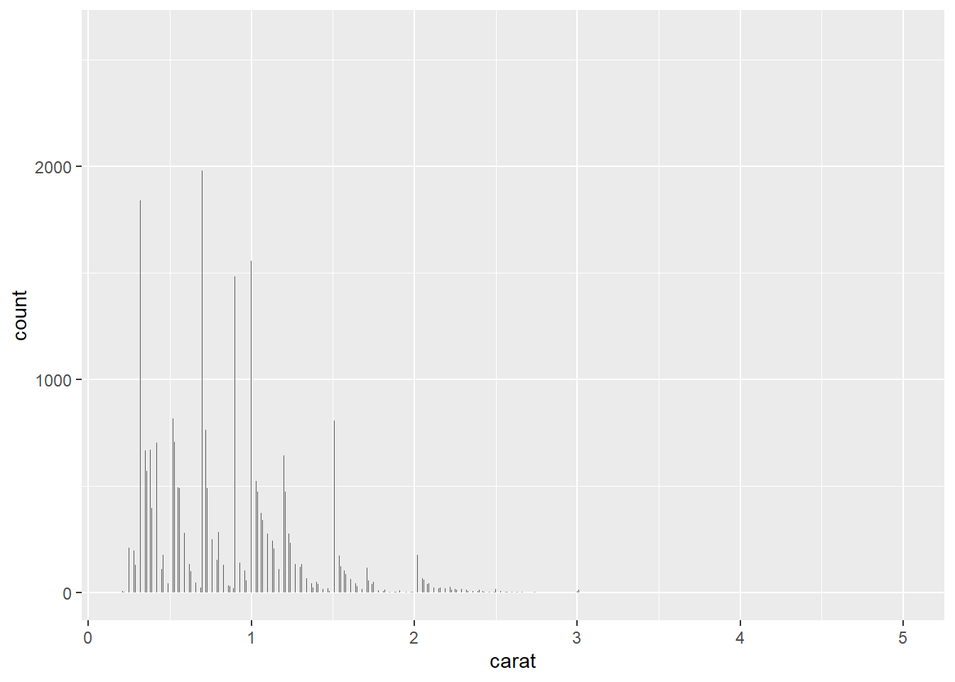
Using binwidth values of 1/50 & 1/100 shows that the caret values heavily sit on half and quarter caret values, skewing right until it breaks again.
4. Explore the distribution of the price variable in the diamonds data. How does the distribution vary by cut?
ggplot(diamonds, aes(price)) + geom_freqpoly()
ggplot(diamonds, aes(price)) + geom_freqpoly(aes(color = cut))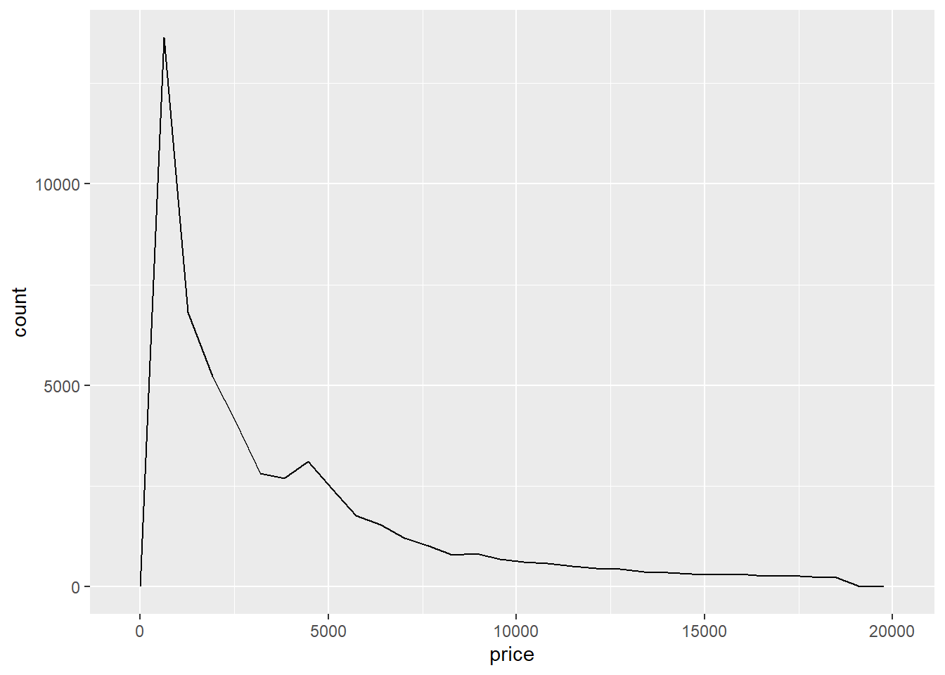
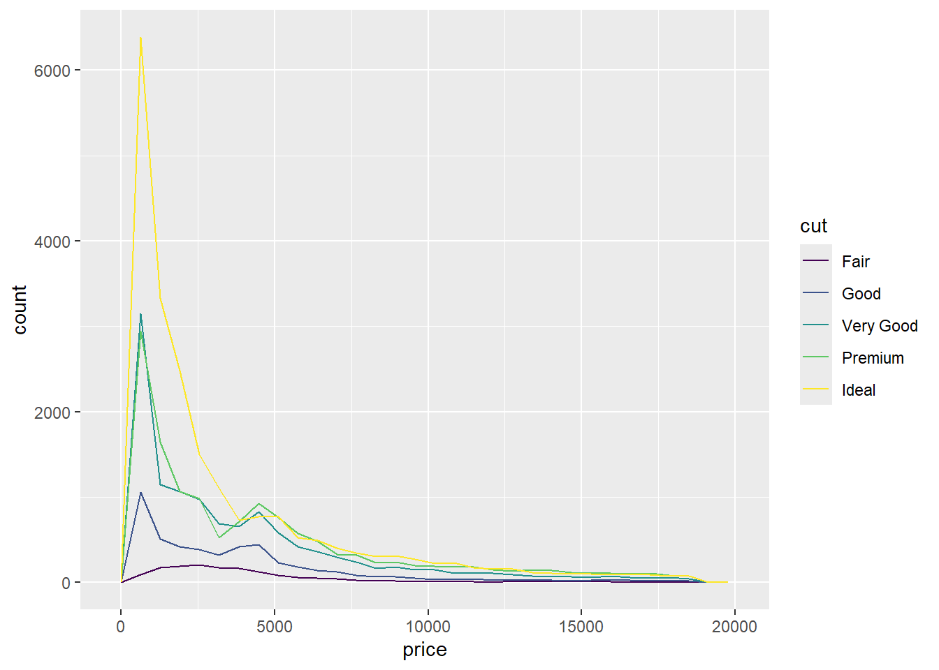
The regular and segmented plots both show a similar distribution. I’m not surprised that higher value cuts sell more, but I am surprised that all the cuts sell the most at the same price range. I would’ve thought that higher value cuts would seller at higher prices more frequently.
5. You now know (at least) three ways to compare the distributions of subgroups: geom_violin(), geom_freqpoly(), and the color aesthetic, or geom_histogram() and faceting. What are the strengths and weaknesses of each approach? What other approaches could you try?
The strengths and weakness were outlined pretty well above, but you could also try adjust with the transparency of the data points, which also can be used with two sets of continuous variables.
ggplot(mpg, aes(drv, hwy)) + geom_point(alpha = 0.2) # Category vs Continuous
ggplot(mpg, aes(cty, hwy)) + geom_point(alpha = 0.2) # Continuous vs Continuous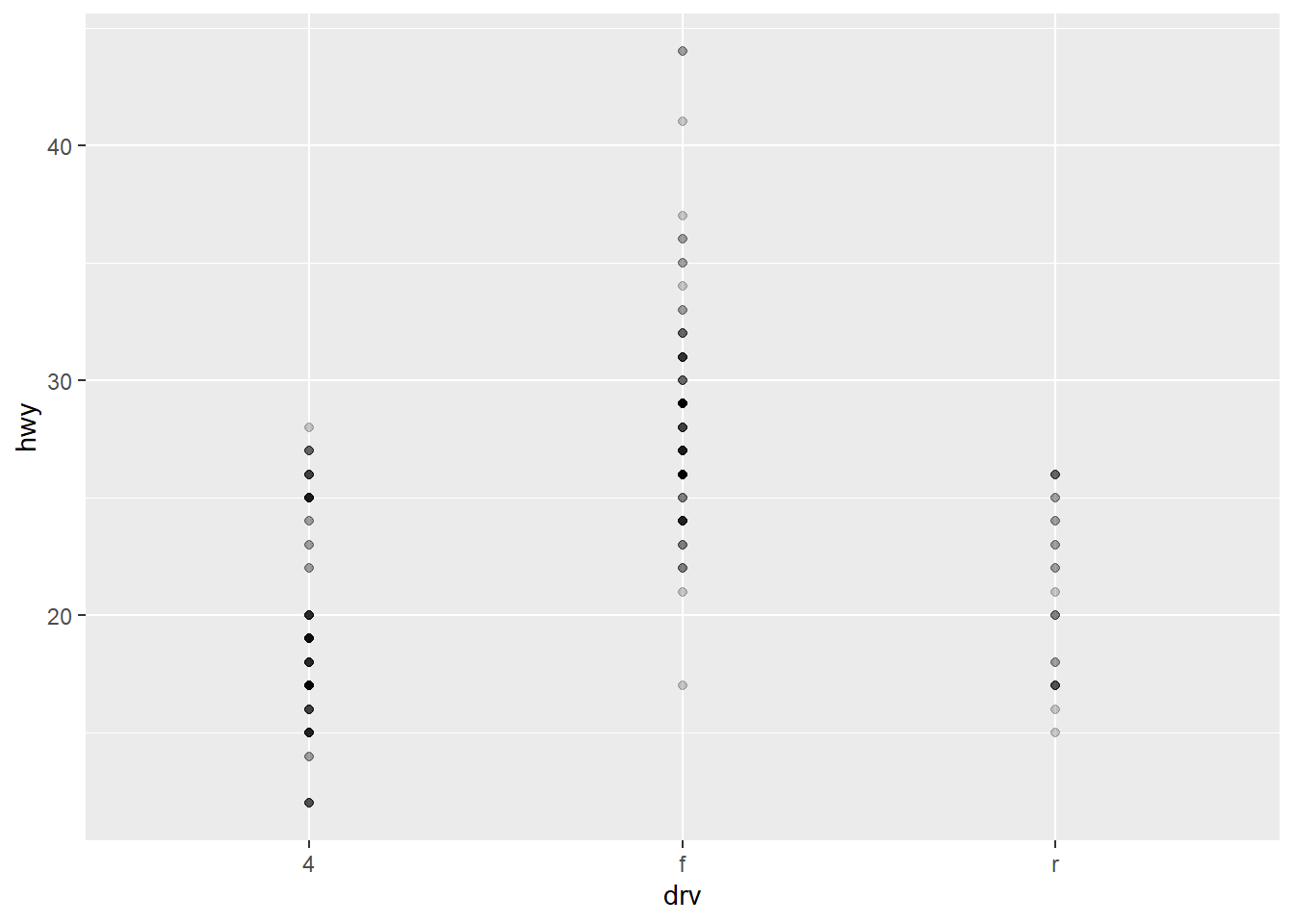
6. Read the documentation for geom_bar(). What does the weight aesthetic do?
The weight argument in the geom_bar() function allows you to adjust the heights of the bars according to the weights of the observations rather than simply counting the number of observations. This can be useful when you have a frequency or probability data set and you want to visualize it accurately.
data = tibble(
  category = c("A", "A", "B", "B", "B", "C", "C"),
  weight = c(1, 2, 1, 3, 1, 2, 1)
)

# Plot without weights
ggplot(data, aes(category)) + geom_bar()
# Plot with weights
ggplot(data, aes(category, weight = weight)) + geom_bar()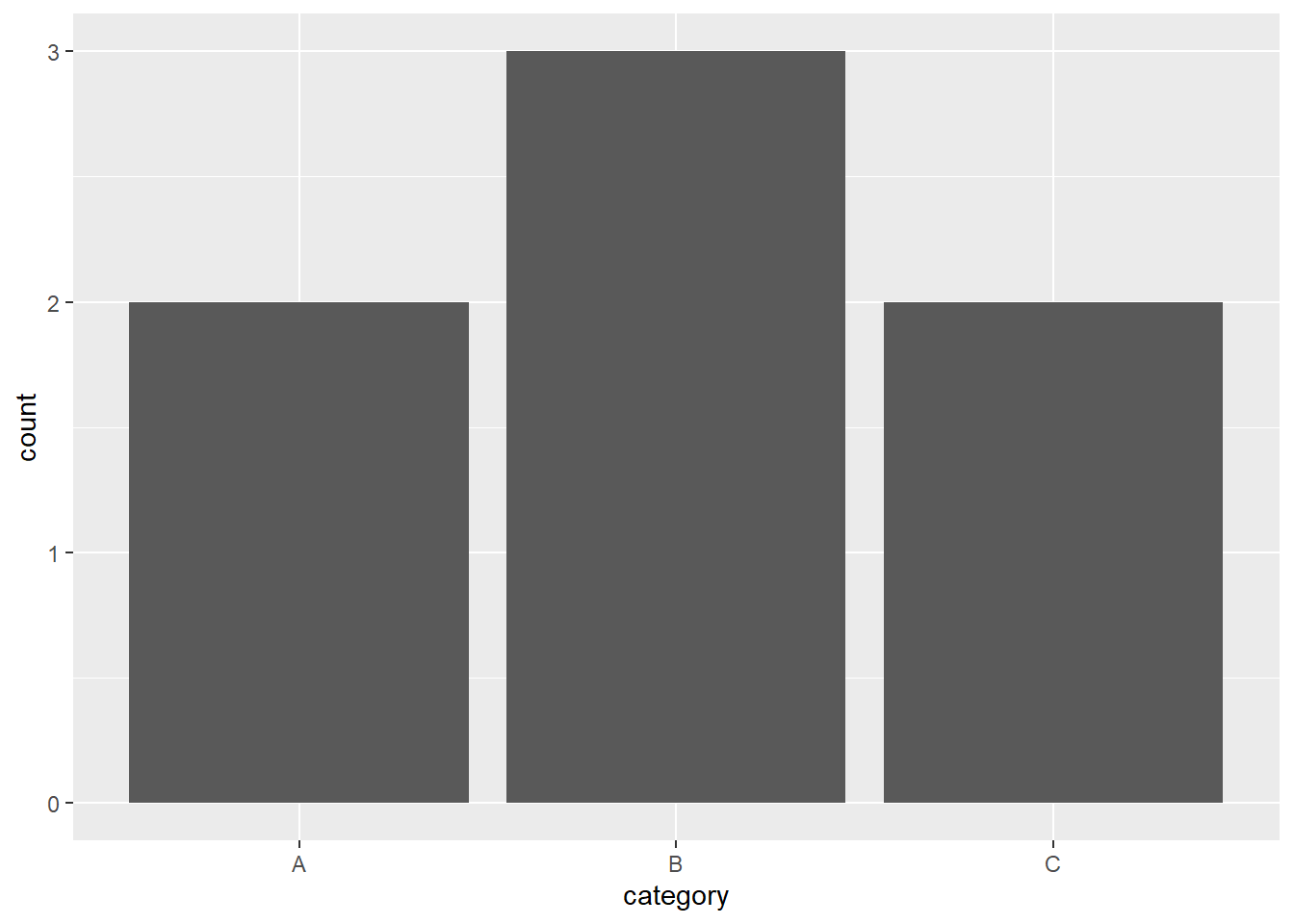
7. Using the techniques already discussed in this chapter, come up with three ways to visualize a 2d categorical distribution. Try them out by visualizing the distribution of model and manufacturer, trans and class, and cyl and trans.
ggplot(mpg, aes(manufacturer, model)) + geom_point(aes(size = hwy))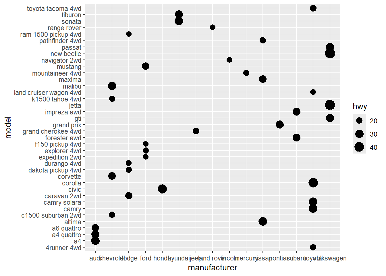
ggplot(mpg, aes(class, fill = trans)) + geom_bar()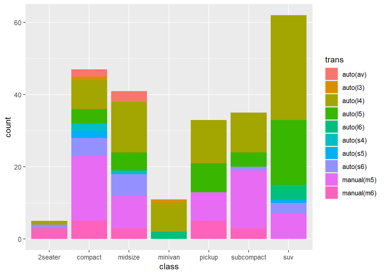
ggplot(mpg, aes(cyl)) + geom_bar() + facet_wrap(~trans, nrow = 2)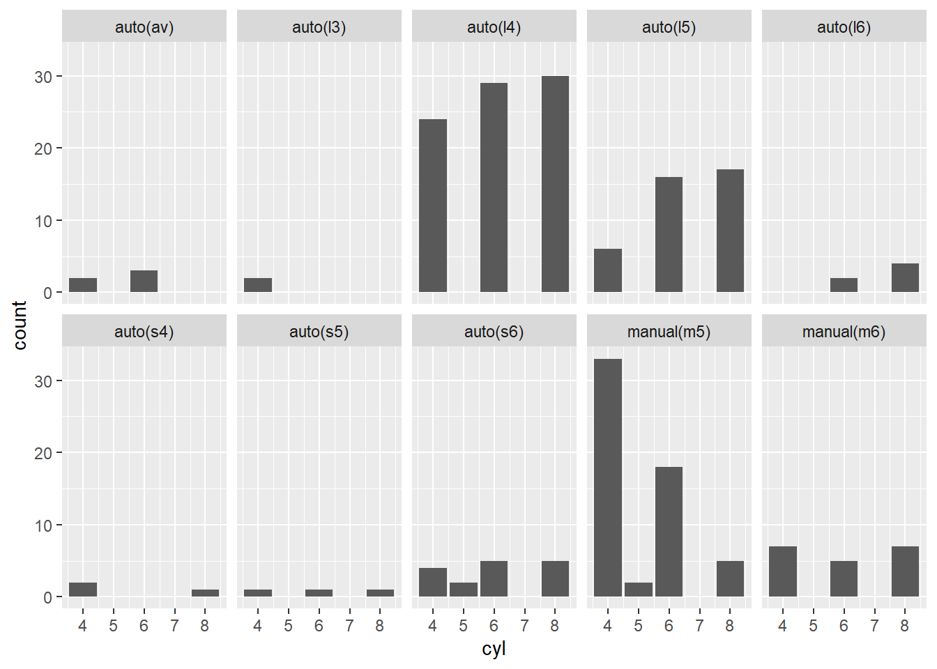
Not the most insightful plots in the world, but the restrictions were met :)
2.7 Modifying the Axes
There are two families of useful helpers that let you make the most common modifications.
xlab()andylab()modify the x-axis and y-axis labels:
ggplot(mpg, aes(cty, hwy)) + geom_point(alpha = 1 / 3)
ggplot(mpg, aes(cty, hwy)) + geom_point(alpha = 1 / 3) +
  xlab("city driving (mpg)") + ylab("highway driving (mpg)")
# Remove the axis labels with NULL
ggplot(mpg, aes(cty, hwy)) + geom_point(alpha = 1 / 3) + xlab(NULL) + ylab(NULL) and ylab()-1.png)
 and ylab()-2.png)
 and ylab()-3.png)
xlim()andylim()modify the limits of the axes:
ggplot(mpg, aes(drv, hwy)) + geom_jitter(width = 0.25)
ggplot(mpg, aes(drv, hwy)) + geom_jitter(width = 0.25) + xlim("f", "r") + ylim(20, 30)
# For continuous scales, use NA to set only one limit
ggplot(mpg, aes(drv, hwy)) + geom_jitter(width = 0.25, na.rm = TRUE) + ylim(NA, 30) and ylim()-1.png)
 and ylim()-2.png)
 and ylim()-3.png)
Warning
Changing the axes limits sets values outside the range to NA before it calculates summary statistics. You may use na.rm = TRUE to filter out the new NA values, but it is important to understand the order of operations.
2.8 Output
Plots are usually generated to view immediately, but they can be saved to a variable:
p = ggplot(mpg, aes(displ, hwy, color = factor(cyl))) + geom_point()Once you have a plot object, you can do a variety of things with it:
- Render it on screen with
print()(this happens automatically when running interactively, but needs to be called explicitly in a loop or function):
print(p)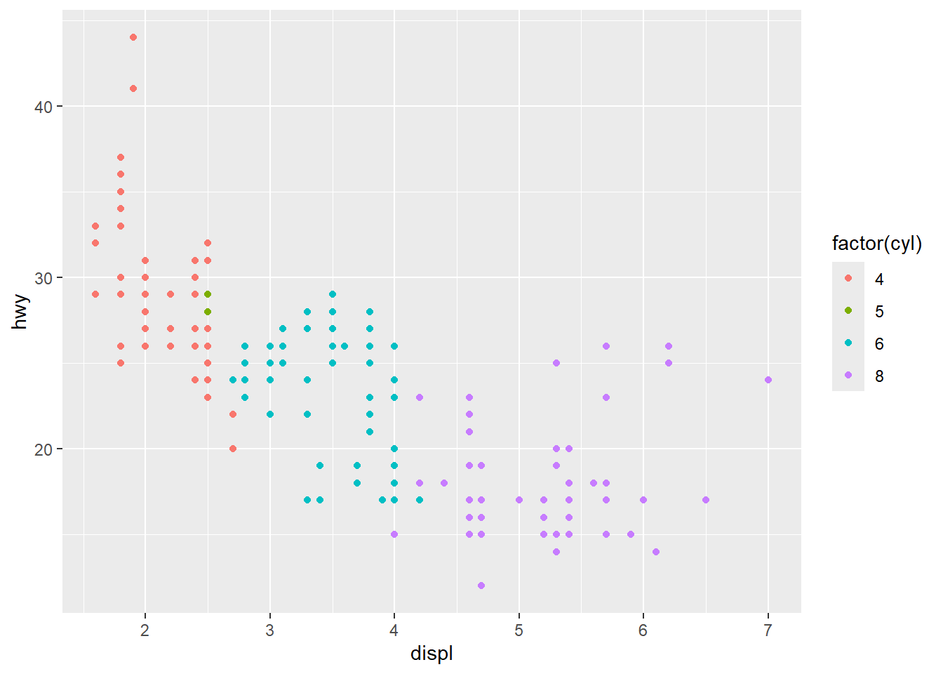
- Save it to disc with
ggsave():
ggsave("plot.png", p, width = 5 , height = 5)- Briefly describe its structure with
summary():
summary(p)data: manufacturer, model, displ, year, cyl, trans, drv, cty, hwy, fl,
class [234x11]
mapping: x = ~displ, y = ~hwy, colour = ~factor(cyl)
faceting: <ggproto object: Class FacetNull, Facet, gg>
compute_layout: function
draw_back: function
draw_front: function
draw_labels: function
draw_panels: function
finish_data: function
init_scales: function
map_data: function
params: list
setup_data: function
setup_params: function
shrink: TRUE
train_scales: function
vars: function
super: <ggproto object: Class FacetNull, Facet, gg>
-----------------------------------
geom_point: na.rm = FALSE
stat_identity: na.rm = FALSE
position_identity